Normally, I don't write opinion pieces. When I post something to this blog, it's usually about a new and completely majestic addition to one of our many systems. Not today, so I understand if you are already disappointed.
As mentioned in the last post, I've been doing a TON of Site Builder training throughout the division, more than we've ever done before, and I've noticed that the trainings have changed quite a bit in the four years I've been doing them. What started as a "click here to make this happen" approach to Site Building has become a "consider this approach" to disseminating your content.
I spend more and more time engaging the audience in a conversation about *how* to create better sites rather than simply sticking to the feature list. I do this because Site Builder 3 ushers in a new era for site creation in the division. You are no longer beholden to the structure of Site Builder 2's rigid template. You can put anything anywhere in SB3, and you are using a system with a more thoughtful and branded design.
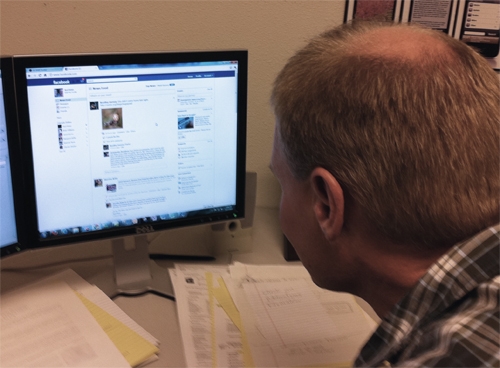
Yesterday, Karl and I were discussing the success of Facebook over MySpace. Once upon a time, MySpace was the clear leader in social networking. What did they do wrong? What did Facebook do right?
There are two contributing factors that I believe aided this leadership change. First, Facebook has a universal brand, and it isn't you. MySpace was always a cluttered mess of content and design. It was grown-up version of GeoCities, the long-time home to the worst practices of web design. Even in its infancy, Facebook was clean and clear. Once you found your way around, you rarely would get lost, except during their controversial application upgrades.
The second feature of Facebook that I believe helped them gain momentum is that they "moved the conversation" to front and center. No longer did you have to look for a place to post your thoughts or comment on a friend’s message. Communication made completely simple. This key piece of Facebook has not changed much in the past few years. The conversation is still in the spotlight.
Site Builder 3 offers us all an opportunity to move the conversation. Your home page can be an stream of blogs, a series of photos, an invitation to the end-user to participate. The old way of listing 10-20 programs on a page seems schizophrenic when you consider your site as a potential for conversation. Can you imagine if someone walked into your office, and the first thing you said was everything?
One of the reasons I've been conducting so many trainings is because I find this opportunity to be truly exciting. Hopefully, for those of you who have attended a training this year, you have sensed that this is a real chance to improve how we conduct business online.
Attached Images:
