The term 'Web Accessibility' refers to the practice of making webpages usable by as many people as possible.
Using a handful of conventions, web programmers can accommodate users with a variety of disabilities: impaired vision, impaired hearing, and illiteracy. These conventions are typically easy to implement and merely require that programmers and designers be aware of their importance. When done correctly, they offer a great boost to the ease at which users with disabilities can access online content.
Most of the conventions exist to help screen reader software--such as JAWS and ZoomText on Windows computers, and VoiceOver on Mac computers--jump to the main content of a webpage, increasing the ease at which the user can access that content.
Other conventions exist to offer an alternative view of the information on a page, such as a text transcript of an audio file, a text description of an image, or a disclaimer that a particular link will open a new browser window. These text descriptions of visual elements can be read to the user by screen reader software.
Below is an screenshot of the UCANR.org homepage. Notice how the mouse cursor hovering over the image of the fruit has prompted a little text bubble to appear (you may have seen this on other webpages across the web). This little text bubble is an example of the descriptive 'alt text' that can be used to make images more accessible to the visually impaired. Again, this descriptive text can be verbally read to the user by screen reader software. So, while a blind user will not be able to see the image, at least they will know what subjects are depicted in the image.

The HTML code to implement 'alt text' is easy to use! It is a single attribute for use within an image tag. In most applications, the addition of this code can be done dynamically, making its consistent implementation much easier to accomplish.

Also easy to use is the 'title' code for hyperlinks. Notice in the image above that there is a title that includes "(New Window)". This text exists to alert screen reader software that the hyperlink will open a new browser window, which is an action that could make navigation for a visually impaired user very difficult. Because of this bit of text, the software can warn the user before the user follows the link, preventing the user from being removed from the content they came to see.
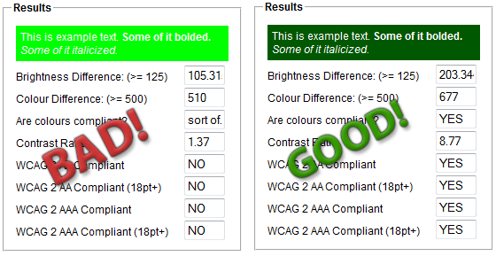
Other important conventions involve the careful use of color and contrast on webpages. Colors should be carefully selected to ensure legibility. Low contrast color combinations such as white on light green, light grey on white, and yellow on green should be avoided. Complementary color combinations should also be avoided: red and green, yellow and blue, purple and orange can all cause visual flickering that will make a web page inaccessible to some users.
Below is a comparison of two color combinations; one bad, one good. The good one offers maximum legibility.

All of the above practices are being implemented on a daily basis by the ANR Communication Services Web Action Team! We care about accessibility and you should too!
For more information:
§1194.22 of Section 508 Amendment to the US Rehabilitation Act