
Get the most out of your signs
Winter is a great time to do all the work you are too busy to do in the spring and summer. One of the things you can do is think about your signage for the upcoming marketing season. An effective sign makes the job of selling much easier and winter is the perfect time to design and make your signs. Recently I read an article on the Greenhouse Grower website that discussed the latest research into effective signage. I am going to give you the highlights and hopefully you can use this information to create effective roadside signs as well as hard hitting farmers' market signs. If you would like to read the entire article click on this link:
http://www.greenhousegrower.com/retailing/roadside-signs-research-shows-what-works-best
The information provided in the article was gleaned from a study performed by the United States Sign Council (the USSC) and is primarily concerned with using data to influence local sign ordinances for road side signs. I am not going to go into sign ordinances, but I am going to share the bits of information that the study uncovered that you can use to create signs that are easy to read, allow your customers to react to them in a timely way, and effectively convey your message. Even though the study and data refer to roadside signs I think many of the principles can be applied to farmers market signs as well.
When creating signs the study uncovered five key areas that you need to address. The areas are:
- Viewer reaction time
- Viewer reaction distance
- Letter height
- Copy area
- Negative space
I will give you a brief description of each area and point out what I think are the most important aspects you will need to focus on.
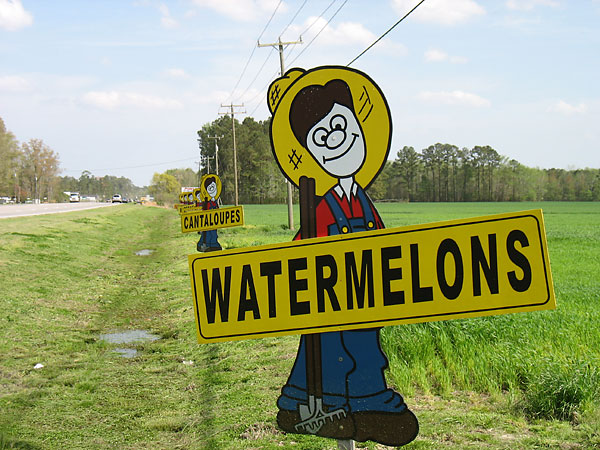
Viewer reaction time is the amount of time it takes for someone to notice your sign and make a decision about what they read. According to the study it takes one half to one second for someone to notice a sign and then it takes one tenth of a second for every letter or symbol to be read and understood. For example if you had a sign by your road side stand that said “Farm Fresh Produce 100 feet” it would take between 2.8 and 3.3 seconds for a driver to notice and read your sign. Another interesting finding is that people only notice signs that are within 10 degrees to the left and right of the way they are traveling. In order to maximize viewer reaction time make your signs short and put them near the road or on the outside of edges of your market booth.
Viewer reaction distance describes what happens when a viewer reads your sign and decides to take action. This tells you how far the reader will travel while they read your sign, comprehend the meaning, and commit to action. For someone in a car this will tell you how far away you need to put your sign from your drive way. This distance is most important for road side signs, but I think there is some lessons here for farmers market signs too. The idea would be to place a sign in such a way that the shopper at a farmers market can read the sign, comprehend the meaning, and turn into your booth rather than walk by with all the other people on a crowded market day. Calculating the viewer reaction distance takes two steps. Step one figure out how fast the person or car is traveling in miles per hour and multiply by 1.47 feet per second (fps). To give you an idea an average person walks at 3.1 miles per hour which equals 4.56 fps or a car traveling at 60 MPH equals 88.2fps. Once you have this number you can multiply it by the Viewer reaction time we discussed above to get the Viewer Reaction Distance. Following along with our example a person walking at 4.56fps * 2.8 seconds = 12.77 feet. So now you know you need to put signs up for walkers that are clearly visible from 12.77 feet from your booth at the farmers market.
Letter Height this one is tricky. The folks at USSC have a lots of charts with lots of numbers with a factor that they call the legibility index so I can't give you a quick answer on this area. What I can say is that it depends on how far away you want someone to be able to read your sign. A simple rule is for every 10 feet away you want your sign to be readable you need to add one inch to the letter height. For a sign readable at 30 feet 1 inch tall letters are the minimum height. For a sign readable at 300 feet your letters should be at least 10 inches tall. One important thing to keep in mind is that signs are easier to read if they are a mix of Capitals and lower case letters. If your sign is all in all capitals you need to increase the letter height by 15% to make it readable at the same distance. Shouting in all caps on the internet works, but it doesn't work as well with signs.
Copy and Negative Space talks about what is and what is not on your sign. Copy is your message and negative space is the empty parts of the sign. To maximize readability you should have 60% of the sign being negative space. The lesson here is don't make your signs too busy. You goal is to communicate your message quickly so make sure what you put on the sign doesn't detract from your goal.
Now that you are armed with the latest data go get to work on your signs. Spring is just around the corner and that means you are going to be too busy to think about this kind of stuff. With a little effort now you can have all of your signage ready for your upcoming marketing season and you will know that they will be effective.
