- Author: Blake Sanden
- Contact: Blake Sanden
- Editor: Julia Stover
This is the second BLOG for our 2020 Pistachio Irrigation Demo where we will attempt to put up relevant data and images to help growers see alternative monitoring methods in action over 3 different mature pistachio production orchards from Eastside to Westside, non-saline to saline soils. This DEMO BLOG is intended not only to give you easy to digest summary irrigation management snapshots, but also allow for your feedback/questions which I will attempt to address as time allows. Fortunately, none of these Demo orchards had blanking problems this spring. For a summary of yield, applied water and tree stress (using the pressure chamber to measure stem water potential, SWP) for 2019 go to the website hosted by the UCD FNRIC.
For this second BLOG we are going to focus on the Eastside non-saline orchard only and revisit the CERES remote sensing aerial imagery of tree water stress (calculated from the canopy temperature as determined by infrared camera) and Normalized Differential Vegetative Index (NDVI, basically a plant volume and vigor estimate calculated from a normalized ratio of near infrared reflectance over the entire infrared spectrum). In BLOG 1 we looked at how the last image just before harvest (9/6/2019) compares with just a couple weeks ago (4/25/2020) and how the in-field ground-based stem water potential (SWP) pressure bomb readings compare. This is where interpreting this kind of imagery gets tricky…
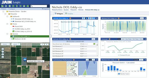
Point 1, adequacy of winter recharge: Like most pistachios in the SJV this orchard gets a couple inches post-harvest irrigation and is then cutoff to dry down the trees before winter to avoid frost damage. Jain Logic is supporting this Demo Monitoring project with 5 sites across the 3 orchards we monitor. Using Sentek Drill & Drop capacitance soil moisture probes they continuously monitor stored soil water and when the system is pressurized. Lots of analyses are available. The intro to each site looks like this:
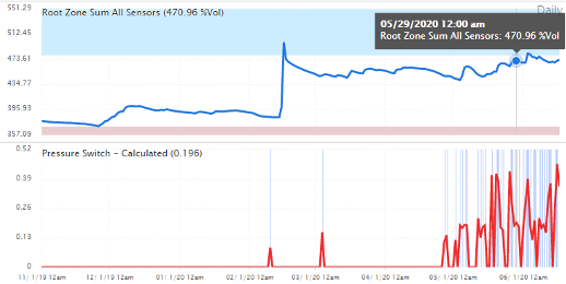
Below is a larger chart showing rootzone soil moisture from 11/1/2019 to 6/17/2020. The blue zone is field capacity (“Wet”) and the gray zone is “Dry”. The grower maintained the old flood system which was used around 2/10 to get the 6” recharge spike shown below. The bottom chart shows the calculated inches applied by the hours run and pressure in the hose. So recharge was good by mid-February.
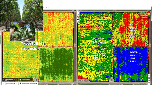
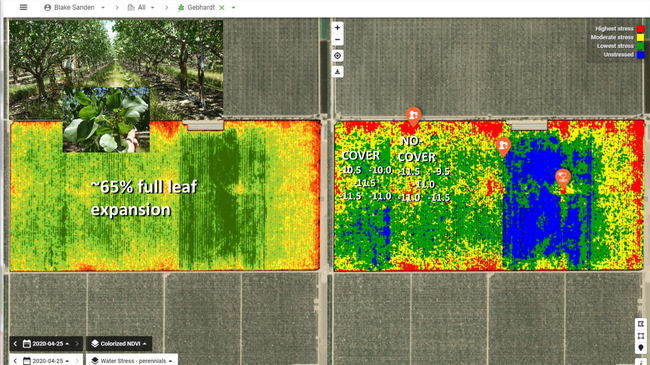
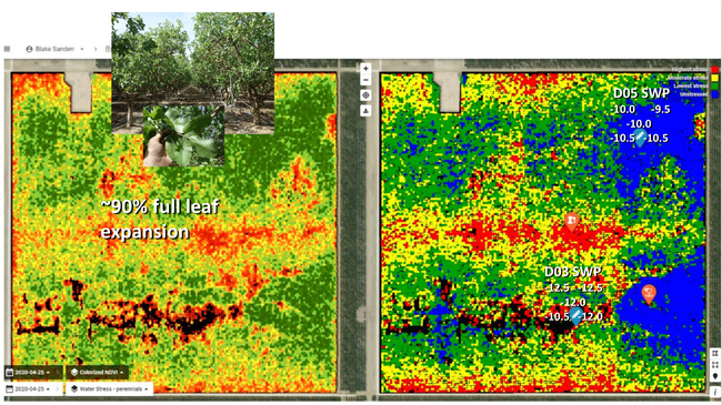
Point 2, leaf expansion-NDVI: CERES changed the NDVI color scheme from last year to increase the contrast resolution so the red and yellow now correspond to last year's least green more open areas. Eventually, CERES is going to provide numbers to go with these images, but my eyeball calculator says that the 4/25/2020 NDVI in the Eastside west 80 acres is less than the NDVI in the 9/6/2019 image. This makes sense because as of 4/25 the full leaf expansion was about 75% -- so smaller leaves and no cluster weight pulling branches down like in the 9/6 image means that the trees appear to have a lower density of foliage in the aerial image.
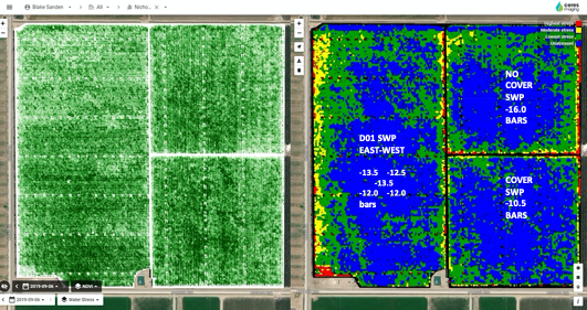
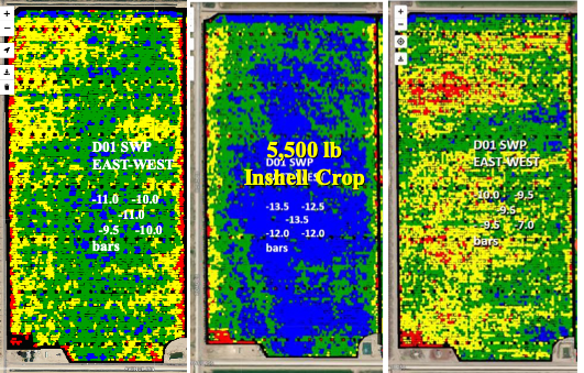
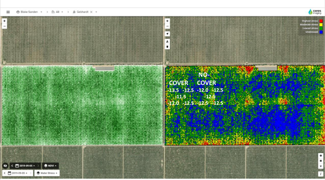
CERES IMAGING NDVI & THERMAL WATER STRESS (9/6/2019, 4/25/2020, 5/16,2020)
By 5/16 (below image) the leaves are 100% expanded (but the branches/canopy cover is not bowed down by crop weight) and the “stress” image shows a little more blue than 4/25, but still a lot less blue than 9/6 when the pressure bomb leaf measured stem water potential (SWP) was more negative (more stressed) than the spring SWPs shown in these images. The SE cover cropped field still dominates the color scale with the most blue and green.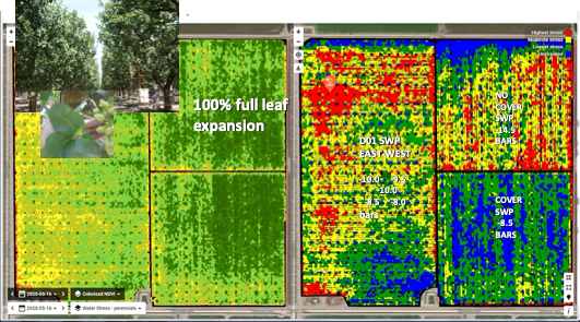
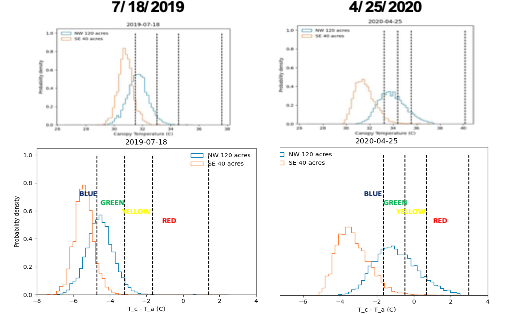
Point 3, Accuracy of Water Stress and relative color scheme: Comparing the Water Stress images from September to April is like a slap in the face! Your first thought is, “Wow, these fields were not sufficiently pre-irrigated to refill the profile and there is less water in the rootzone then there was right before the 2019 harvest!” But this is not true. Compare the SWP readings I show in white for 9/6 versus 4/25 and 5/16. These ground-based tree readings ran -12 to -16 bars on 9/6/2019 (-14 bars is moderate stress). But for 4/25 and 5/16/2020 these numbers are much less negative at -7 to -11 bars, which is what you want to see – no stress during the spring push. But why is there much less blue (least stress color) in west 80 acres for the 4/25 image compared to the 9/6 image? Unfortunately, this an artifact of the automatic coloring legend used by CERES at this time. For any given image they calculate a type of crop water stress index (CWSI) using the NDVI cover, humidity, some standard “stress” temperature and most importantly the canopy temp for each pixels from the warmest to coolest then they create a frequency distribution to show the range of stress across the field – coolest as blue, hot is red. This colorized scheme is an accurate representation of the relative variability in canopy temperature/stress at that time for all 3 fields in this quarter section, but it is not an absolute measure of real plant stress, like the SWP number from the pressure bomb, that can be compared across different images. It is also important to remember that SWP and actual ET are NOT the same thing nor are they linearly related. Three “water stress” images for the western 80 acre field (which is our main monitoring effort) are shown below. The 7/18/2019 and 4/25/2020 showed similar SWP readings but the color scale of the 4/25 image shows more stress.
The below charts show what the canopy temp/CWSI “water stress” frequency distributions looks like when calculated separately for the cover crop SE 40 acres vs the non-cover crop W 80 and NE 40 acres. For the 7/18 image you can see that the peaks of each area are close together and have a similar spread, so almost everything is blue and green. But for 4/25 the differences in CWSI between these two areas has a much bigger spread, with virtually all the SE 40 pixels falling in the BLUE zone and almost all the NW 120 pixels falling in the GREEN, YELLOW, and RED zones.
Canopy temperature (CWSI) frequency distributions for NW 120 ac Non-Cover (W-80, NE-40) and SE 40 ac Cover
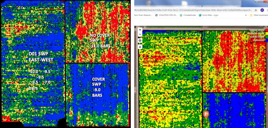
The below left hand image shows the “water stress” color scale recalibrated for the Non-cover and Cover fields on a separate field basis instead of for the whole quarter section – compared to the original single scale distribution, right.
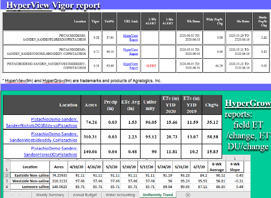
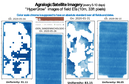
Point 4, Need for a constant calibration and numeric evaluation across dates and fields: So is it necessary that imagery gives me a constant color scale and numeric evaluation of stress across the whole season and all my fields? For simply looking at the snapshot of field stress uniformity and seeing where the problem areas are the answer is NO. Obviously, the high resolution (0.5-1 ft/pixel) CERES images are some of the best out there for zeroing in on the crop and eliminating a lot of the dirt/floor background. But in my book you need some kind of database/Excel spreadsheet record with a constant value scale that can be analyzed to tell you if that field is improving, getting worse, or falling behind your other fields on the same soil type. Constant color images to flip through would be the final icing on the cake. CERES is making efforts in this direction. But as of right now, for this purposes of this Pistachio Irrigation Monitoring Demonstration, Agralogic, Ltd is bundling their HyperView/HyperGrow service with Jain Logic customers using various satellite platforms to supply growers with weekly Excel table field ET and uniformity updates. The field apparent ET is calculated using infrared canopy temperature and other atmospheric variables from satellite overpass images that occur every 5 to 10 days. This generates the numbers reported to growers and constant color-scale (shades of light to dark blue) images. The downside here is that your pixel/data resolution is now 10-30 m (33 to 100 feet, only one thousandth the data density of CERES images), includes the dirt between the rows and of course can have problems with cloud interference. I feel like their ET data is reasonably in the ballpark, but their uniformity numbers are on the high side when compared with CERES images – but of course you have much less data per field where every pixel is 1.5 to 4 trees across 2 rows, so this kind of averaging will dampen tree to tree variability but may be valid when comparing one or two acres in the SW to a couple acres in the NW of an 80 acre field.
The white areas in the below images indicate the parts of the field obscured by cloud cover – so no data.
- Author: Blake L Sanden
- Contact: Blake L Sanden
- Editor: Julia Stover
The start of the 2020 pistachio season has been a mixed bag. Most of the southern San Joaquin Valley had decent chill hours, but heat units for bloom were a mixed bag and then we hit the 2.5” rainstorm from 4/5-9 during early bloom instead of February where it should have been. Leaf out was uneven and many young orchards, especially, had problems with blanking along last year's shoots. The cause is still uncertain but see Craig Kallsen's (Kern County Subtropical Advisor) latest newsletter for a good discussion (http://cekern.ucanr.edu/?newsitem=84945).
This is the opening BLOG for our 2020 Pistachio Irrigation Demo where we will attempt to put up relevant data and images to help growers see alternative monitoring methods in action over 3 different mature pistachio production orchards from Eastside to Westside, non-saline to saline soils. This DEMO BLOG is intended not only to give you easy to digest summary irrigation management snapshots, but also allow for your feedback/questions which I will attempt to address as time allows. Fortunately, none of these Demo orchards had blanking problems this spring. For a summary of yield, applied water and tree stress (using the pressure chamber to measure stem water potential, SWP) for 2019 go to the above website hosted by the UCD FNRIC.
For this first BLOG we're going to take a quick look at CERES remote sensing aerial imagery of tree water stress (calculated from the canopy temperature as determined by infrared camera) and Normalized Differential Vegetative Index (NDVI, basically a plant volume and vigor estimate calculated from a normalized ratio of near infrared reflectance over the entire infrared spectrum). We will see how the last image just before harvest (9/6/2019) compares with just a couple weeks ago (4/25/2020) and how the in-field ground-based stem water potential (SWP) pressure bomb readings compare. This is where interpreting this kind of imagery gets tricky…
Point 1, NDVI: CERES changed the NDVI color scheme from last year to increase the contrast resolution so the red and yellow now correspond to last year's least green more open areas. Eventually, CERES is going to provide numbers to go with these images, but my eyeball calculator says that the 4/25/2020 NDVI in the Eastside west 80 acres is less than the NDVI in the 9/6/2019 image. This makes sense because as of 4/25 the full leaf expansion was about 75% -- so smaller leaves and no cluster weight pulling branches down like in the 9/6 image means that the trees appear to have a lower density of foliage in the aerial image. This difference is less in the Lemoore saline field as the 4/25 leaf expansion was 90%.
Point 2, Accuracy of Water Stress and relative color scheme: Comparing the Water Stress images (right hand image, all fields) from September to April is like a slap in the face! Your first thought is, “Wow, these fields were not sufficiently pre-irrigated to refill the profile and there is less water in the rootzone then there was right before the 2019 harvest!” But this is not true. Compare the SWP readings I show in white for 9/6 versus 4/25. These ground-based tree readings ran -12 to -19 bars depending on the field and salinity at harvest indicating that stored rootzone water was depleting and creating some stress in the trees (-14 bars is moderate stress). But for 4/25 these numbers are much less negative at -9 to -13 bars, which is what you want to see – no stress during the spring push. But why is there much less blue (least stress color) in the 4/25 image compared to the 9/6 image? Unfortunately, this an artifact of the automatic coloring legend used by CERES and most imaging companies. For any given image they take the coolest pixel temperature and make that range blue. Since they are working with only 4 colors in the legend (blue to red) the program divides the range of canopy temperatures in a given flyover into 4 zones to give you the colorized image. This colorized scheme is an accurate representation of the relative variability in canopy temperature/stress at that time, but it is not an absolute measure of real plant stress, like the SWP number from the pressure bomb, that can be compared across different images. For example, the Eastside 9/6 image may have had an average canopy temperature of 95 F, with the coolest to hottest temps running 93-98 F. Now the 4/25 image was maybe an average temp of 82 F with a range of only 81-83 F. And for this image the coolest area is the SE 40 acres with an actively growing cover crop of Brome grass, so now the western 80 acres gets colored mostly yellow even though it may be only 0.7-1 degree higher canopy temp then the SE 40. This is another reason why it would be helpful to have actual numbers and not just colored pixels for these images.
Point 3, Cover crop interaction: An actively growing cover crop will significantly influence remotely sensed canopy temperature and reflectance of other wavelengths (near infrared, NIR, for example most often associated with chlorophyll content) and can skew the real results from just the trees when you have hedged during the winter and a lot of the drive is visible between the trees. This is very clearly shown in the Eastside location where the Brome grass was planted later and responded vigorously to the 2.5” of rain in early April. This effect was not as pronounced on the Westside field for the Cover vs. No Cover zones as the Brome had been seeded in November and had already set seed and was dying down by 4/25. The bluest (coolest) area in this field was clearly associated with the irrigation set to the east that had come on at 7:00 AM, which is also confusing as I was told that this 300 acre field irrigates in two sets ... And so the blue area should have extended to the eastern edge of the field.
Point 4, Boots on the ground, in-field tree and soil moisture measurements essential: the SWP pressure bomb readings confirmed the lack of stress on the trees despite minimal “blue/no stress” in the CERES images. Hand probing, neutron probe, tensiometers, Sentek Drill & Drop capacitance probes with Jain Logic transmitters and web-based processing all tell us that there is plenty of soil moisture storage. Walking the field and observing good shoot growth and leaf expansion confirm we're on track. Our Phytech dendrometers to measure tree trunk shrink/swell as a direct measure of tree stress are currently functioning at only 2 sites in the Lemoore saline field. We will discuss these other technologies in future BLOGS.
EASTSIDE NON-SALINE Sandy Loam
CERES IMAGING
NDVI & THERMAL WATER STRESS
(9/6/2019, 4/25/2020)
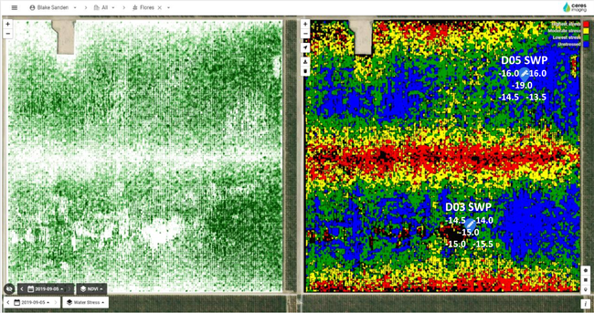
WESTSIDE NON-SALINE Sandy Loam (no cover crop) and Clay Loam (cover crop)
CERES IMAGING
NDVI & THERMAL WATER STRESS
(9/6/2019, 4/25/2020)
LEMOORE SALINE & SEMI-SALINE
Clay Loam
CERES IMAGING
NDVI & THERMAL WATER STRESS
(9/6/2019, 4/25/2020)

