Slide Presentation Tips
I get to see a lot of the Toolkit elements "in action."
I'm going to give you some feedback on your Powerpoint presentations.
Sometimes there's just too much information on a slide. Photos crowd out the branding elements. Charts and graphs cover all but a sliver of the background.
I understand that sometimes you have a lot of information to convey - success is how you handle these large amounts of information.
So here is a secret:
It's OK to have a slide in your presentation that doesn't have the branding. Once you've established the theme of the presentation, it's OK to have a slide with a blank background that contains large photos, charts, or graphs.
You need to have a slide that contains just a large photo? Go for it!
You've got charts and graphs? Go for it!
And better yet - it's easy! So here's how you do it:
I'm working on an update of We Are ANR so I'll use that as an example.
Here are the first 4 slides:

In the first slide the photo collage overlaps the slide theme a bit. The overlap isn't pronounced and it overlaps into a gradient area of the background art. I need to establish the brand to my audience on this first slide, so I'm going to leave this overlap in place on this one.

Slide 2 - no problem.

Slide 3 - again, a bit of an overlap, but since it's about the same as on the first slide I'm going to leave it as is.

Slide 4 - Now here we've clearly got a problem, right?
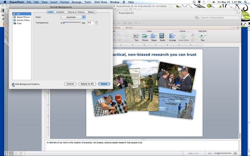
I could fiddle with the images and make them smaller, but then they lose their clarity and impact. Since I now have my branding established, I'm going to hide the background art on this slide only.
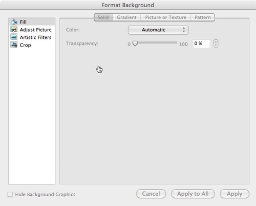
With the slide you want to edit on your screen, go to Format Background. You can get there on the menu under Format or if you're a Ribbon person it's on the Themes tab.


Check that box, click apply and poof! Your slide has a white background.

Now take a look at your slide and see what needs adjusting now that the background is gone. In this case, re-centering the header would be a good idea.