
As accessibility becomes a key component of designing content and user experience, ESRI has integrated a suite of tools across its platform – this includes both ArcGIS Pro and ArcGIS Online. Accessibility features in ArcGIS Pro and ArcGIS Online continued to remain in focus at ESRI's User Conference this year even though AI related sessions garnered the most spotlight. To demonstrate its commitment towards making its products and technology accessible to all users, the ESRI User Conference had sessions dedicated to making web-apps accessible as well as features in ArcGIS Pro to meet the WCAG requirements.
The previous blog post on this topic only focused on StoryMaps. It covered features available in ArcGIS StoryMaps such as high contrast basemaps and color contrast ratio checker to make sure that the font colors for different levels of heading and paragraphs have sufficient contrast. Some of these features are common across the suite of ESRI products. For example, the symbology for making maps accessible based on colorblind friendly schemes are available in ArcGIS Online and ArcGIS Pro. While visualization is a key feature of making maps and web-GIS products accessible, being able to navigate the apps using keyboard shortcuts is another important feature of creating an accessible experience. Keyboard shortcuts are key to helping in case of a temporary situation that may prevent someone from using a mouse extensively.
This blog post covers key highlights related to accessibility from the ESRI User Conference. It will provide you a glimpse of various tools and components that are available to design products not only for the viewers of maps and apps designed in ArcGIS suite of products but also for their software users.
Configuring pop-ups with plain text in web-maps and dashboards
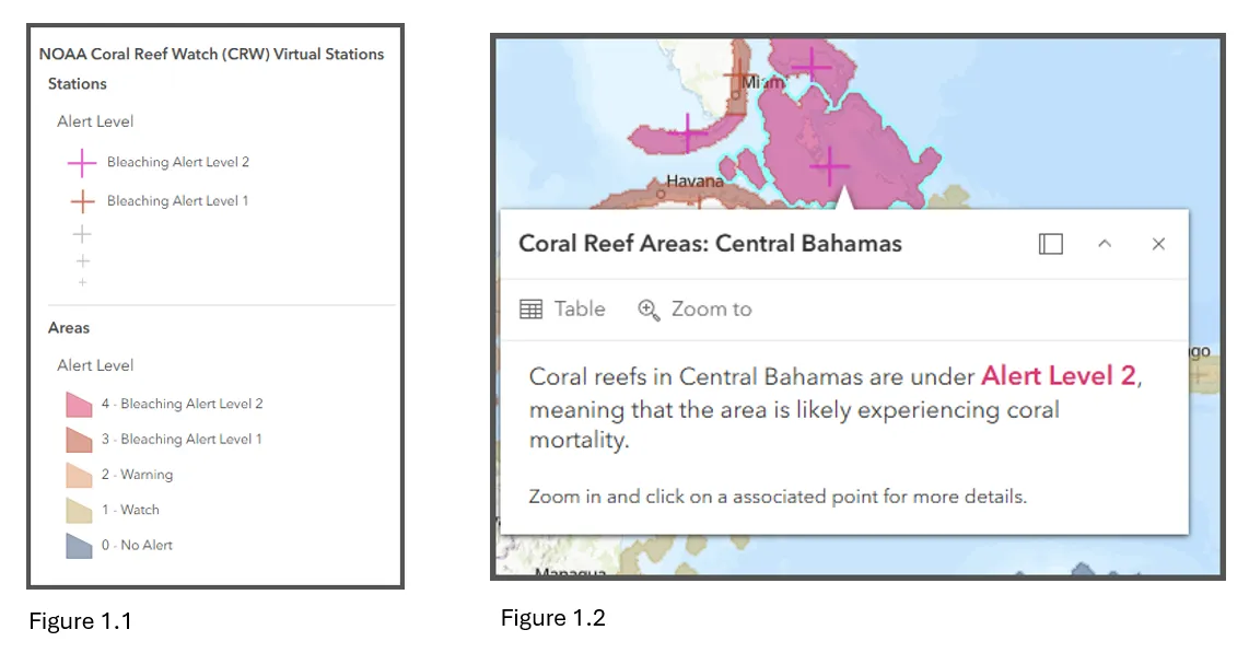
Typically, pop-ups in a web-map are displayed as a table by default. However, tables are hard to read for the screen reader. They do not have a pleasant experience even for the user. With pop-ups configured in plain language, it is very easy for the screen reader to read a paragraph of text associated with that feature. Figure 1.1 displays the legend and Figure 1.2 displays the pop-up for the legend. This example of a pop-up designed in plain language was demonstrated at the ESRI User Conference in one of the sessions to encourage users to adopt text-based pop-up format as opposed to a tabular approach. The symbology only states the categories, but a viewer does not know what these categories mean. In this case, the pop-up not only states the categories associated with the selected location but also what that label means in plain language.
Keyboard widget visibility in Instant App
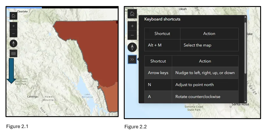
Keyboard functionality is a key component of designing web-apps that are accessible. ArcGIS Instant Apps has a widget that the designer of the app can enable and it will allow the widget to be displayed on the top of the app as shown in Figure 2.1. Thus, a user can click on the widget ( Figure 2.2) and see which shortcuts to use for navigating the app without using the mouse. While these functionalities are available in other web-apps such as ArcGIS Dashboards, they are not as obvious as they are in Instant App. This makes the onus on the user to know the keyboard shortcuts to move from one element of the dashboard to another.
High contrast basemaps in Map Viewer
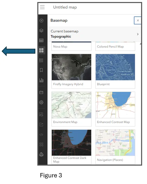
To make web-maps meet accessibility guidelines, ESRI has designed high color contrast basemaps. This would make certain features on the map stand out. Another feature of making basemaps more accessible are place labels. In some of the basemaps, the font color of the labels and colors of the basemap do not have sufficient contrast. While ESRI provides some default high contrast basemaps that are ready to use, we are not limited to these options only. We could also use Vector Style Editor to customize basemaps. Figure 3 shows the various basemaps available in Map Viewer, including high contrast basemaps.
Colorblind friendly color scheme in Map Viewer
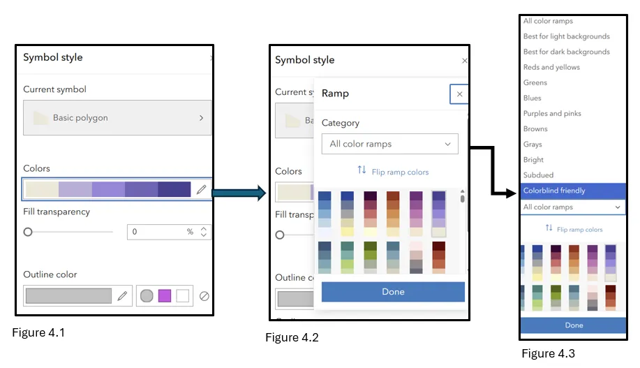
ArcGIS Online's Map Viewer has several options to view colorblind friendly color schemes. In order to view these styles, one would go to Symbol Style and then go to All color ramps and from there choose colorblind friendly option. Figure 4.1-4.3 demonstrates how to find such styles for web-maps.
Colorblind friendly color scheme in ArcGIS Pro
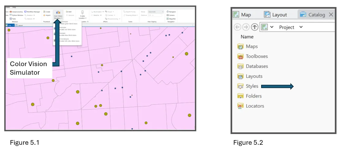
Similar to ArcGIS Online, Colorblind Friendly schemes are also available in ArcGIS Pro. In ArcGIS Pro, on the top ribbon there is a color vision simulator tool that can simulate different levels of visual impairments and provide color schemes that are most appropriate for that condition as shown in Figure 5.1. One could also go to the Styles option in the Catalogue Pane as demonstrated in Figure 5.2 and find colorblind friendly styles . Additionally, there is also a Color Ramp Tester on ArcGIS Maps that a user could go to and test different options based on a color ramp.
Tagging the pdf of an exported map in ArcGIS Pro
ArcGIS Pro has a feature to tag maps when exporting the map in the layout view. While ArcGIS offers many different ways to export a map such as tiff, jpeg, png – one has to select pdf format in order to tag it. When an exported map in a pdf format is not tagged, a screenreader will read the map title, labels, and all the content in a haphazard way that may not make sense. However, with tagged pdfs and ensuring reading order is organized in a logical way, it makes much more sense when listening to the content through a screenreader. Figure 6.1 and 6.2 reveal the options to add Alt Text to an exported map from ArcGIS Pro, adding accessibility tags as well as organizing the reading order.
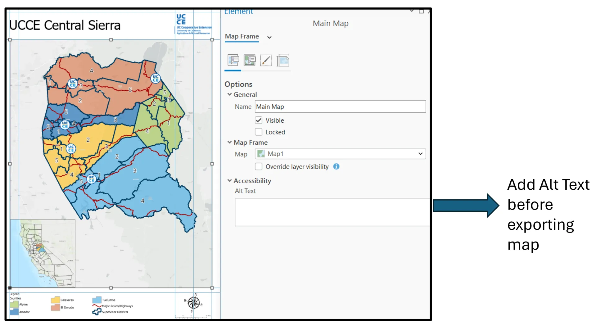
Figure 6.1
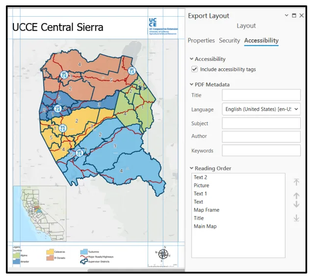
Figure 6.2
Keyboard Shortcuts in ArcGIS Pro
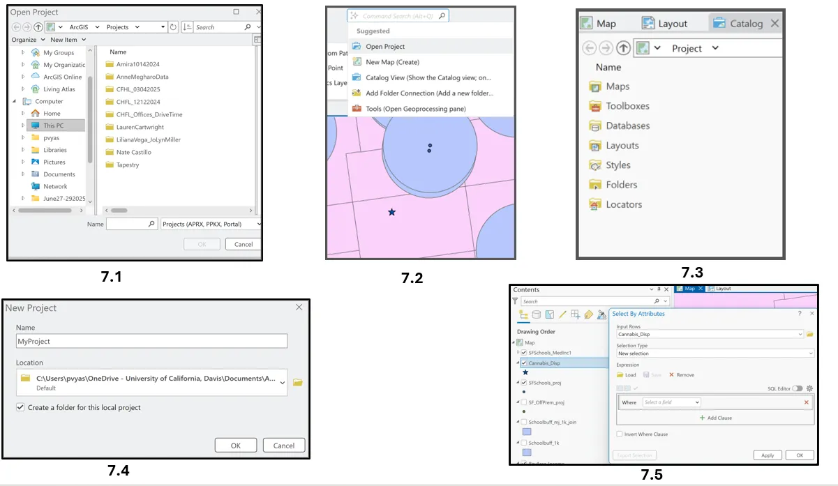
ESRI has designed different keyboard shortcuts at the global level or those that are applied overall to the project and task specific shortcuts to make its software more accessible. For those who are accustomed to programming, keyboard shortcuts may not be something one would rely on a lot. but there could be some tasks for which one relies on the mouse. And that's when keyboard shortcuts may make your life easier. A user can also customize the shortcuts based on frequently used tools or change the shortcuts if they don’t like the default options. On the top ribbon, users can go to the Help tab and from there view existing shortcuts and/or add new shortcuts.
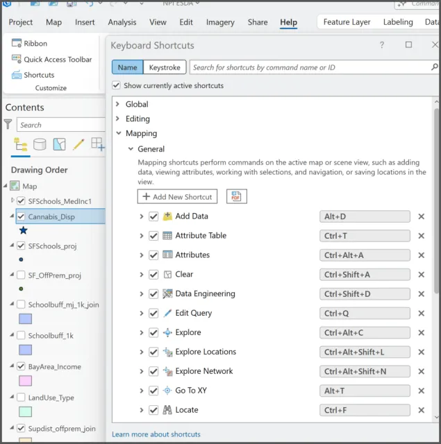
For example, Ctrl O opens a project in ArcGIS Pro ( Figure 7.1). Alt Q opens the command search as shown in Figure 7.2. Ctrl+Alt+T allows a user to view the attribute table without right clicking on the layer. Ctrl +Shift+C allows to add a folder connection in the catalog pane. Alt + D takes you directly to the Folder to add data. Ctrl N opens a new project (Figure 7.4) and Ctrl+T directly opens the attribute table ( Figure 7.5) This document shows the extensive list of keyboard shortcuts available in ArcGIS Pro.
Since creating a digital experience that is accessible to everyone is a journey and not a destination, this blog post only covers some of the features in the ESRI environment while more efforts are under way.