
We have released a new CKEditor Bootstrap Grid module that lets you create responsive grid layouts (rows and columns) inside IWP text editor using Bootstrap. This is great for building structured layouts and provide more flexibility for your content.
What It Can Do
- Insert rows and columns into content
- Control column widths
- Add text, images, or media inside each column
- Help ensure your layout is mobile-friendly
To learn more about grids, visit https://getbootstrap.com/docs/5.3/layout/grid/
Tips for Layouts
- Use 12-column logic: Bootstrap grids are based on 12 columns (e.g., 6+6, 4+4+4).
- Keep mobile in mind: Bootstrap grids are responsive by default.
- Don’t overload columns with too much content.
How to Use It
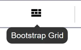
- Open the Text Editor for your content and look for the new Bootstraps Grid icon. Please your cursor where you want to insert the grid and then click the Bootstrap Grid icon.
- In the popup, choose a layout (e.g., 2 columns, 3 columns) and then select Next button.

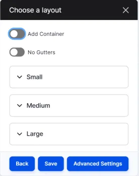
Choose the layout for your grid and then click Save button.
Add Container: Containers are a fundamental building block of Bootstrap that contain or wrap your grid, pad (45px padding on the sides), and align your content.
Gutters: The padding between your columns, used to responsively space and align content in the Bootstrap grid system.
Container:
Small, Medium and Large: We have 3 options for breakpoints, each with a set of additional controls for allocating sizes of each column. For more visit, https://getbootstrap.com/docs/5.3/layout/grid/#grid-options
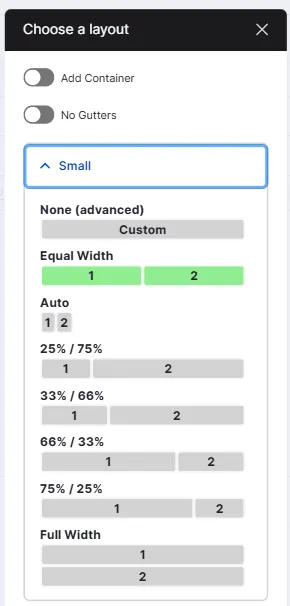
Example: if you select Small, the following are the options that allow you to allocate width based on selection.
- Edit the grid by clicking inside each column to add your content such as inserting text, images or other media. Use the text editor toolbar to format content as needed.

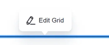
- If you need to adjust Column Sizes, select the grid and then click Edit Grid button when hovering over the grid.
Using Bootstrap Utility Classes
You can enhance your grid layout using Bootstrap utility classes for background colors, spacing, and borders. See below for a couple of examples that can be applied on the Advanced Settings when you click to Edit Grid.
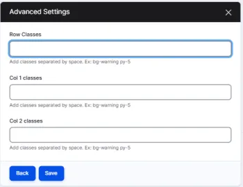
Background colors
Learn more at - https://getbootstrap.com/docs/5.3/utilities/background/
bg-* so bg-primary is the primary color background, bg-danger is a hot red.
Margin and Padding
Learn more at - https://getbootstrap.com/docs/5.3/utilities/spacing/#margin-and-padding
m for margin (outside the grid), p for padding (inside).
0 - 5 for levels. 0 Remove, 5 is the most, 3 is the default so you don't have to set it.
Examples m-0 p-5
You can then add additional options with a second letter.
t for top, b for bottom, x for left and right, y for top and bottom.
mt-5 for big margin on top, my-5 for big margin on top and bottom.
Borders
Learn more at - https://getbootstrap.com/docs/5.3/utilities/borders/
- border
- border border-dark