I Need More Help!
Request assistance using the IT Help System*.
*Non-ANR personnel should contact their local coordinator or site administrator for assistance.
Best Practices
Where do I begin?

- What is the site about?
- Whom is it intended to serve?
- What is the primary content of the site?
- Who will moderate it?
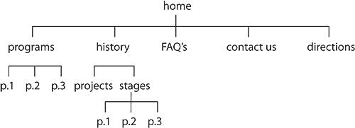
Once you get a feeling for the flow and structure of your site, it's helpful to create a site diagram. A simple diagram will help you visualize the site's structure and you can then use it as a guide as you build the site. Here's a very basic example:

Homepage
Your homepage should be uncluttered and brief. It should explain what your site is about and include a few helpful assets containing, say, news and related current events. A nice related photo can enhance the page and help break up heavy text. Refrain from long descriptions and irrelevant links, and keep the page tidy by compartmentalizing the different assets that you use.
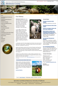
A simple start would be to write a brief description of the site or its purpose and place that in a text box at the main center body of the page. This section will be the most visible area of the page for your visitors, so make it straightforward, attractive, and welcoming. A photo on the right-hand side can add an attractive element to help engage site visitors. Click the thumbnail on the right to see an example of a well laid-out home page, or simply visit the site. You will notice that the site has its main essential components in place:- The navigation on the left houses all the pertinent pages under their main headings.
- The center column has an introduction, and below that a few blog assets.
- The right hand column has a narrow "Current News" blog asset, and below that a "Contact Information" text asset.
This simple combination helps visitors get a quick idea of the site's direction and focus and helps guide visitors along to the page they might be searching for or simply allows them to understand the site structure so they can browse the site efficiently according to their interests.
Images
Don't hesitate to use images on your site! It's a nice way to keep people interested and break up the monotony of large text blocks. Please keep a few simple principles in mind:
- Edit your images. Crop them to direct the visitor's attention to your area of focus.
- Use the correct image size. It's best to crop and re-size your images to the size and shape you will be using on your site. Also, save them in a web-friendly format. You will get the best results with images that are RGB, 72 dpi, and saved as a jpeg or png document. Don't hesitate to contact us if you have any questions.

