- Author: Maggi Kelly
- Contributor: Andy Lyons
- Contributor: Shane Feirer
Hello everyone, we hope you are all healthy, safe, sane, and being as productive as possible.
Here we provide a summary of some of the mapping technology that has been used in the past few weeks to understand the COVID-19 pandemic. This is not exhaustive! We pick three areas: map-based data dashboards, disease projections, and social distancing scorecards. We look at where the data comes from and how the sites are built. More will come on the use of remote sensing and earth observation data in support of COVID-19 monitoring, response or recovery, and some of the cool genome evolution and pandemic spread mapping work going on.
Before we begin, here is a nice primer from the cartonerd himself Kenneth Field from ESRI on how to map the coronavirus responsibly.
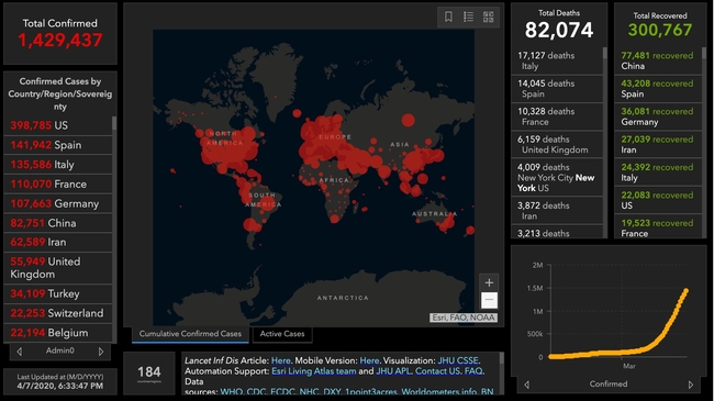
COVID-19 map-based data dashboards. You have seen these: data dashboards displaying interactive maps, charts, and graphs that are updated daily. They tell an important story well. They usually have multiple panels, each visualizing a dataset in either map or graph or tabular form. There are many many data dashboards out there. Two favorites are the Johns Hopkins site, and the NYTimes coronavirus outbreak hub.
Where do these sites get their data?
-
Most of these sites are using data from similar sources. They use data on number of cases, deaths, and recoveries per day. Most sites credit WHO, US CDC (Centers for Disease Control and Prevention), ECDC (European Centre for Disease Prevention and Control), Chinese Center for Disease Control and Prevention (CCDC), and other sources. Finding the data is not always straightforward. An interesting article came out in the NYTimes about their mapping efforts in California, and why the state is such a challenging case. They describe how “each county reports data a little differently. Some sites offer detailed data dashboards, such as Santa Clara and Sonoma counties. Other county health departments, like Kern County, put those data in images or PDF pages, which can be harder to extract data from, and some counties publish data in tabular form”. Alameda County, where I live, reports positive cases and deaths each day, but they exclude the city of Berkeley (where I live) because it has its own city health department, so the NYTimes team has to scrape the county and city reports and then combine the data. Remember that there are many people out there who think these reports actually underestimate the number of cases out there, partly due to insufficient ability to test for the disease.
-
Some of the sites turn around and release their curated data to us to use. JH does this (GitHub), as does NYTimes (article, GitHub). This is pretty important. Both of these data sources (JH & NYTimes) have led to dozens more innovative uses. See the Social Distancing Scorecard discussed below, and these follow-ons from the NYTimes data: https://chartingcovid.com/, and https://covid19usmap.com/.
- However… all these dashboards are starting with simple data: number of patients, number of deaths, and sometimes number recovered. Some dashboards use these initial numbers to calculate additional figures such as new cases, growth factor, and doubling time, for example. All of these data are summarized by some spatial aggregation to make them non-identifiable, and more easily visualized. In the US, the spatial aggregation is usually by county.
How do these sites create data dashboards?
-
The summarized data by county or country can be visualized in mapped form on a website via web services. These bits of code allow users to use and display data from different sources in mapped form without having to download, host, or process them. In short, any data with a geographic location can be linked to an existing web basemap and published to a website; charts and tables are also done this way. The technology has undergone a revolution in the last five years, making this very doable. Many of the dashboards out there use ESRI technology to do this. They use ArcGIS Online, which is a powerful web stack that quite easily creates mapping and charting dashboards. The Johns Hopkins site uses ArcGIS Online, the WHO does too. There are over 250 sites in the US alone that use ArcGIS Online for mapping data related to COVID-19. IGIS uses this platform to create most of our map-based websites and dashboards (for more info on that, see the bottom of the post). Other sites use open source or other software to do the same thing. The NYTimes uses an open source mapping platform called MapBox to create their custom maps. Tools like MapBox allow you to pull data from different sources, add those data by location to an online map, and customize the design to make it beautiful and informative. The NYTimes cartography is really lovely and clean, for example.
An open access peer reviewed paper just came out that describes some of these sites, and the methods behind them. Kamel Boulos and Geraghty, 2020.
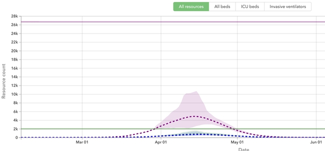
COVID-19 disease projections. There are also sites that provide projections of peak cases and capacity for things like hospital beds. These are really important as they can help hospitals and health systems prepare for the surge of COVID-19 patients over the coming weeks. Here is my favorite one (I found this via Bob Watcher, @Bob_Wachter, Chair of the UCSF Dept of Medicine):
-
Institute for Health Metrics and Evaluation (IHME) provides a very good visualization of their statistical model forecasting COVID-19 patients and hospital utilization against capacity by state for the US over the next 4 months. The model looks at the timing of new COVID-19 patients in comparison to local hospital capacity (regular beds, ICU beds, ventilators). The model helps us to see if we are “flattening the curve” and how far off we are from the peak in cases. I've found this very informative and somewhat reassuring, at least for California. According to the site, we are doing a good job in California of flattening the curve, and our peak (projected to be on April 14), should still be small enough so that we have enough beds and ventilators. Still, some are saying this model is overly optimistic. And of course keep washing those hands and staying home.

Where do these sites get their data?
-
The IHME team state that their data come from local and national governments, hospital networks like the University of Washington, the American Hospital Association, the World Health Organization, and a range of other sources.
How do the models work?
-
The IHME team used a statistical model that works directly with the existing death rate data. The model uses the empirically observed COVID-19 population and calculates forecasts for population death rates (with uncertainty) for deaths and for health service resource needs and compare these to available resources in the US. Their pre-print explaining the method is here.
On a related note, ESRI posted a nice webinar with Lauren Bennet (spatial stats guru and all-around-amazing person) showing how the COVID-19 Hospital Impact Model for Epidemics (CHIME) model has been integrated into ArcGIS Pro. The CHIME model is from Penn Medicine's Predictive Healthcare Team and it takes a different approach than the IHME model above. CHIME is a SIR (susceptible-infected-recovery) model. A SIR model is an epidemiological model that estimates the probability of an individual moving from a susceptible state to an infected state, and from an infected state to a recovered state or death within a closed population. Specifically, the CHIME model provides estimates of how many people will need to be hospitalized, and of that number how many will need ICU beds and ventilators. It also factors social distancing policies and how they might impact disease spread. The incorporation of this within ArcGIS Pro looks very useful, as you can examine results in mapped form, and change how variables (such as social distancing) might change outcomes. Lauren's blog post about this and her webinar are useful resources.
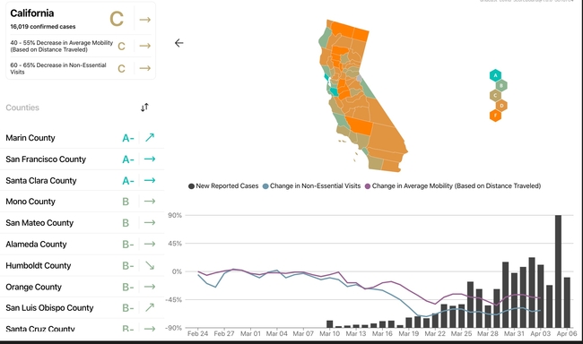
Social distancing scorecards. This site from Unicast got a lot of press recently when it published a scoreboard for how well we are social distancing under pandemic rules. It garnered a lot of press because it tells an important story well, but also, because it uses our mobile phone data (more on that later). In their initial model, social distancing = decrease in distance traveled, as in, if you are still moving around as you were before the pandemic, then you are not socially distancing. There are some problems with this assumption of course. As I look out on my street now, I see people walking, most with masks, and no one within 10 feet of another. Social distancing in action. These issues were considered, and they updated their scorecard method. Now, in addition to reduction in distance traveled, they also include a second metric to social distancing scoring: reduction in visits to non-essential venues. Since I last blogged about this site nearly two weeks ago, California's score went from an A- to a C. Alameda County, where I live, went from an A to a B-. They do point out that drops in scores might be a result of their new method, so pay attention to the score and the graph. And stay tuned! Their next metric is going to be the change rate for the number of person-to-person encounters for a given area. Wow.

Where does this site get data?
-
The data on reported cases of COVID-19 is sourced from the Corona Data Scraper (for county-level data prior to March 22) and the Johns Hopkins Github Repository (for county-level data beginning March 22 and all state-level data).
-
The human movement data is gathered from mobile devices using GPS, Bluetooth, and Wi-Fi connections. They use mobile app developers and publishers, data aggregation services, and providers of location-supporting technologies. They are very clear on their privacy policy, and they do say they are open to sharing data via dataforgood@unacast.com. No doubt, this kind of use of our collective mobile device location data is a game-changer and will be debated when the pandemic is over.
How does Unicast create the dashboard?
-
They do something similar to the dashboard sites discussed above. They pull all the location data together from a range of sites, develop their specific metrics on movement (the scoring), aggregate by county, and then visualize on the web using custom web design. They use their own custom basemaps and design, keeping their cartography clean. I haven't dug into the methods in depth yet, but stay tuned.
If you want to talk more about these mapping tools, please reach out to IGIS. We have expanded office hours and training to teach you how to make data-driven dashboards, and we can also build them for you. Also, please let us know about other mapping resources out there.
Stay safe and healthy. Wash those hands, stay home as much as possible, and be compassionate with your community.
Super fun. We at IGIS and the Kellylab are working with Drone Scholars on the #Fly4Fall project. Fly4Fall: A citizen science experiment for crowd sourcing UAV data.
Consider being a participant! Here are the contributions so far:
Many of us have watched in horror and sadness over the previous week as fires consumed much of the beautiful hills and parts of the towns of Napa and Sonoma Counties. Many of us know people who were evacuated with a few minutes' notice - I met a retired man who left his retirement home with the clothes on his back. Many other friends lost everything - house, car, pets. It was a terrible event - or series of events as there were many active fires. During those 8+ days all of us were glued to our screens searching for up-to-date and reliable information on where the fires were, and how they were spreading. This information came from reputable, reliable sources (such as NASA, or the USFS), from affected residents (from Twitter and other social media), and from businesses (like Planet, ESRI, and Digital Globe who were sometimes creating content and sometimes distilling existing content), and from the media (who were ofen using all of the above). As a spatial data scientist, I am always thinking about mapping, and the ways in which geospatial data and analysis plays an increasingly critical role in disaster notification, monitoring, and response. I am collecting information on the technological landscape of the various websites, media and social media, map products, data and imagery that played a role in announcing and monitoring the #TubbsFire, #SonomaFires and #NapaFires. I think a retrospective of how these tools, and in particular how the citizen science aspect of all of this, helped and hindered society will be useful.
In the literature, the theoretical questions surrounding citizen science or volunteered geography revolve around:
-
Accuracy – how accurate are these data? How do we evaluate them?
-
Access – Who has access to the data? Are their technological limits to dissemination?
-
Bias (sampling issues)/Motivation (who contributes) are critical.
-
Effectiveness – how effective are the sites? Some scholars have argued that VGI can be inhibiting.
-
Control - who controls the data, and how and why?
-
Privacy - Are privacy concerns lessened post disaster?
I think I am most interested in the accuracy and effectiveness questions, but all of them are important. If any of you want to talk more about this or have more resources to discuss, please email me: maggi@berkeley.edu, or Twitter @nmaggikelly.
Summary so far. This will be updated as I get more information.
Outreach from ANR About Fires
-
ANR has a number of programs dedicated to fire preparedness, recovery, and prevention.
Core Geospatial Technology During Fires
-
Wildfire products
-
Fire perimeters from https://www.geomac.gov/services.shtml
-
The Active Fire Perimeters layer is a product of Geospatial Multi-Agency Coordination (GeoMAC). In order to give fire managers near real-time information, fire perimeter data is updated daily based upon input from incident intelligence sources, GPS data, infrared (IR) imagery from fixed wing and satellite platforms.”
-
-
MODIS hot spots from USFS Active Fire Mapping Program. MODIS The MODIS instrument is on board NASA's Earth Observing System (EOS) Terra (EOS AM) and Aqua (EOS PM) satellites. In addition to lots of other data, MODIS delivers Channel 31 brightness temperature (in Kelvins) of a hotspot/active fire pixel.
-
For more on how these are made: http://www.arcgis.com/home/item.html?id=b4ce4179b04f47e4ba79e234205565c1
-
-
-
WebGIS sites
-
Media using maps (super short list)
-
http://projects.sfchronicle.com/2017/interactive-map-wine-country-fires/
-
NYTimes: Minutes to Escape: How One California Wildfire Damaged So Much So Quickly. https://www.nytimes.com/interactive/2017/10/21/us/california-fire-damage-map.html?smid=fb-nytimes&smtyp=cur
-
NYTimes: How California's Most Destructive Wildfire Spread, Hour by Hour. OCT. 21, 2017. https://www.nytimes.com/interactive/2017/10/21/us/california-fire-damage-map.html?smid=fb-nytimes&smtyp=cur
- SFGate focusing on SkyIMD: http://www.sfgate.com/news/article/incredible-aerial-photos-wine-country-fires-12285123.php
-
-
Social media
-
Twitter: #sonomafires, #napafires, #tubbsfire
-
Flickr: SonomaFires, TubbsFires, NapaFires, etc.
-
Core Technology for Post-Fire Impact
-
High resolution imagery collection and analysis
-
From satellite
-
Planet has made fire imagery available: https://www.planet.com/pulse/northern-california-wildfire-satellite-data-available-for-access/
-
Digital Globe + MapBox made a post-fire tool: (Author: @robinkraft
Email: rkraft4@gmail.com, Github repo, Source: Overview News // DigitalGlobe 2017): https://robinkraft.github.io/norcal-fires-imagery/compare.html; https://blog.mapbox.com/santa-rosa-fire-satellite-imagery-a31b6dfefdf8
- Digital Globe - Open Data Program: https://www.digitalglobe.com/opendata
-
Sonoma Veg Map Program has a few links to interesting stuff including ArcGIS Server Drone and Digital Globe Imagery: http://sonomavegmap.org/blog/2017/10/17/fires/
-
-
From aircraft
-
I know SkyIMD was flying the entire time.
- First Map - Flights 10/11-10/14/17 Here: http://www.skyimd.com/napa-sonoma-fire-imagery-map/
- Second Map - Flight 10/20/17 - Here: http://www.skyimd.com/napa-sonoma-fire-imagery-map-2/
-
-
From drone:
-
Greg Crutsinger from @droneScholars made this available: Aftermath of #TubbsFire: https://www.mapbox.com/bites/00382/#18/38.4763/-122.74861
-
Open Aerial Map has one drone image not sure the source https://map.openaerialmap.org/#/-122.7497720718384,38.471986484020334,16/square/023010201213/59e62be93d6412ef7220c4c0?_k=hm0j7l
-
-
Our big Hopland scientific bioblitz is this weekend (9-10 April, with some events on the 8th) and I look forward to seeing many of you there. If you can't make it to HREC, there are many ways you can remotely help us and check out what is happening all weekend long.
HELP US OUT. http://www.inaturalist.org/ Many people will be using iNaturalist to make and share observations. Helping out the effort is easy. Look for observations at the iNaturalist site by searching for "Hopland" in the "Projects" pulldown menu and choose "Hopland Research Extension Center". Once there, you can browse the plants and animals needing identification and needing confirmation. Every identification counts toward our goal of massively increasing the knowledge of the HREC's flora and fauna.
VOTE ON IMAGES. http://www.hoplandbioblitz.org/ We are hosting an image contest for the plants and animals of HREC. Great prizes will be given for images that get the most votes(REI gift cards and a GoPro grand prize!). Please visit the site and vote for your favorites frequently during the weekend and share them and then sit back and what the slide show.
CHECK US OUT. http://geoportal.ucanr.edu/# Our new app will graphically show you our progress for the bioblitz observations. Results will be updated every 15 minutes. See how your favorite groups are doing in the challenge to document as many species as possible.
Look for #HoplandBioblitz on Twitter and Instagram
Follow along on Facebook https://www.facebook.com/HoplandREC/

I spent two days at the California Economic Summit, held this year in Ontario, heart of the "inland empire". I learned much about this region of the state that I know mostly as freeways connecting water polo games, or as endless similar roads through malls and housing developments. It is more populous, diverse, and vibrant than I had realized. The conference itself was very different from any that I have been to. Hardly any presentations, but break-out groups, passionate, inspiring panelists, tons of networking, good overviews, multiple perspectives, and no partisanship.
Here are some interesting facts about California that I did not know:
- 80% of CEQA lawsuits are related to urban infill development. Shocking. We need infill development as a sensible solution to a growing California.
- 1 in 3 children in the Central Valley live in poverty. 1 in 4 kids live in poverty in the inland empire. These rates are WORSE than they have been ever.
- The Bay Area is an anomaly in terms of education, income, health, voting rates, broadband adoption. The Bay Area is not representative of the state!
- Think of a west-east line drawn across the state to demark the population halfway line. Where might it be? No surprise it is moving south. Now it runs almost along Wilshire Blvd in LA!
- Empowering the Latino community in the state is going to be key in continued success.
- Broadband adoption around the state is highly variable: Latino, poor and disabled communities are far below other communities in terms of adoption.
- The first beer made with recyled water has been made by Maverick's Brewing Company.
- Dragon Fruit might be the new water-wise avocado. Good anti-oxidents, massive vitamin C, good fiber, etc. They taste a bit like a less sweet kiwi, with a bit of texture from the seeds. I don't think I'd like the quac, however.
- In 15 years, the state will be in a deficit of college graduates needed to meet skilled jobs. Those 2030 graduates are in 1st grade now, so we can do some planning.
- Access, affordability, and attainability are the cornerstones of our great UC system.
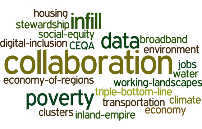
In every session I attended I heard about the need for, and lack of collaboration between agencies, entities, people, in order to make our future better. Here is my wordle cloud of discussion topics, from my biased perspective, or course.


