What Is Lower Third Text?
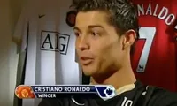
Sometimes it is necessary to add text to a video, particularly when you want to call out a speaker's name.
Text information is usually presented in the lower third of the screen.
Here are some examples:
 |  |
 |  |
Some video, especially news content, relies heavily on lower thirds text. If you have ever watched a news channel you probably have seen their news ticker (also called a chyron) that scrolls across the screen.
For how-to videos, there is not much need for scrolling. We can use a much simpler presentation.
The purpose of lower third text is to present additional textual information without obscuring the video. Telethons utilize lower thirds to show a phone number, but the main focus is always the action on the screen.
If your primary purpose for a clip in your storyboard to to convey textual information only, consider using a solid background instead of overlaying text on video. This is a good way to present bullet points. We don't recommend trying to fit a lot of text in the lower third of the screen in a small font.
UC ANR has its own style of lower thirds text. This guide will show you how to add lower thirds text to your videos using Premiere Elements, but the principles will be the same in any video editor.
Required Assets
While it's possible to just add some text to the bottom of the screen, UC ANR has made a graphical asset available that will make for a professional look.
Here is an example of the lower thirds in use.
There are a few steps involved to add this style of lower third text to your videos.
You will find it easier to add any text to a video after you have completed all the other edits to your timeline.
The first step is to acquire the graphic. This is the yellow and white bar that will be the background behind the text. There is no animation; it is only a still graphic that will lay over the top of the video.
You can get it at this page. (It's currently toward the bottom of the page.) Unzip it and add it to your media for the video.
Also required is having the font Arial installed. Almost everyone will already have this. If you do not have Arial, Helvetica will also work.
Editing Process
The key to adding text to video is to understand that the assets all stack vertically.
The video clip (of the speaker) would be at the bottom, the graphic background asset would be on top of that, and the text would be at the very top. If the order is wrong, the result will not be visible.
The process to add lower third text is this:
- Complete the general video editing on the timeline and determine where you want to add the lower third text
- Drag the lower third background graphic file on to a video track above the main video
- Create a text asset with the correct fonts and add it to a video track directly above the graphic
- (Optional) Animate the appearance or disappearance of the set.
The first 2 steps are fairly straightforward if you have completed the video editing tutorial.
Editing Text
To create a 3 line text asset, open the add text tool and choose "Default Text" from the options. It will choose a white, serif font by default that you will want to change.
If you work in the order suggested below, the process is easy.
14 Easy Steps to Add Text
- Make sure the text insertion tool is active (not the arrow). It should be unless you've done something. Highlight the text.
- Type the person's name, then <Enter> to go to the next line
- Type the person's title, then <Enter> to go to the next line
- Finally type the location or other information such as "UCCE Inyo & Mono Counties" but do not add another line.
- Click the arrow cursor button on the text tool window on the right. Click on the text box you just made. Feel free to center the text box so it's easier to see.
- Change the color to blue. Click on the button that looks like a painter's palette. Once it's open enter these numbers where it has an R, G, and B: R=0, G=85, B=162. This will get you the right color quickly. The box will change color to blue.
- Change the font to Arial and the size to 30. It will shrink a lot.
- Choose the text insertion cursor again. It's the left one.
- Select the top line with the name and change the style to Black. (It's the button to the right of the font's name.) Make the size 40.
- Select the second line and set the style to Narrow.
- Select the third line and set the style to Narrow Bold.
- Click the arrow cursor again and click on the text.
- Change the text justification to centered. You should recognize these buttons from your favorite word processor.
- Drag the text over the graphic so it is centered on the white background.
That sounds complicated, but once you do it, it is easy to repeat.
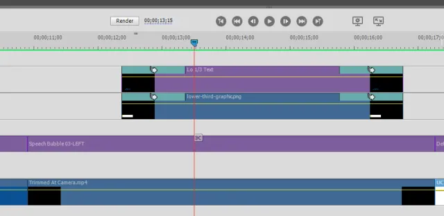
You will want to make sure the text and graphic assets are the same length. They should start and end at exactly the same time. If they don't, it will be out of sync. See the image below—click on it to embiggen.

At this point you should have a complete lower third text that appears and disappears quickly. This is adequate, but it can be animated for a better effect. Close observers will notice on the example timeline image that there are aqua-colored squares on the graphic and text clips. These are from the animation added—in this case a wipe effect.
The next section shows how to animate the appearance of your lower thirds. This is entirely optional.
Adding Animation
There are at least two ways to add animation to the appearance of your lower third text: fading and wiping. Fading is easier in Premiere Elements.
Whichever you choose, be consistent throughout the video. Only use one type of animation.
Remember that each animation takes 1 second. If you want to have the text visible for 5 seconds, you will need to account for the time it takes to present and remove the lower thirds. For example to have text show for 4 seconds with a wipe in and out, the overall text and graphics clip should both be 6 seconds.
Fade In and Out
The simplest animation is to add a fade effect. This will cause the text and graphic to gradually fade in (or out) instead of instantly appearing.
To add this effect right-click on the graphic asset and choose Fade... from the menu. You can add Fade in, out, or both. If the video clip will run longer than the length of the lower third text, choose fade in and out.
If the video clips ends simultaneously with the end of the text, only use fade in.
Repeat this with the text clip. If the two are the same length, they will fade together.
Adding fades in this way does not make the clip look any different in the timeline, but you will see it when you play back the video.
Wipe In and Out
Using a wipe effect will cause the graphic to appear from the side like a file drawer opening and closing. It takes a few more steps to accomplish but looks good. The example video above shows this technique.
Note: if you have other clips that touch the text and graphic at either side, this method won't work without some finesse. This will be unusual in practice, but if it is the case, choose the fade technique.
You can find the Wipe effect under the transitions menu. It's the bluish square bisected diagonally. Wipe is toward the very bottom. Avoid all the unusual wipe choices. You want the one that just says Wipe.
Drag the wipe transition to the left side of the graphic clip. Accept the default options. Repeat with the text clip. Go ahead and test it.
Now let's do closing effect. As above, if the lower third text ends at the same time as the video clip, leave it alone. It will look better without a close.
To add the close, drag the wipe transition to right side of the graphic clip. Where you can choose more options (it says More... on my version) open then. Scroll down through the choices and select Reverse. Repeat with the text clip.
You should have a timeline that looks like the example above with the aqua colored boxes on the ends of the clip. During playback the text will open and close like a drawer.
