As ArcGIS StoryMaps gain popularity for delivery of content in an engaging style, questions arise about how to make them compliant to meet the WCAG ( Web Content Accessibility Guidelines) requirements. Within UC ANR, StoryMaps are being used for a variety of purposes such as report impact of grant funded projects, county annual reports, delivery of education curriculum, and highlighting stories of successful partnerships. The good news is that ESRI – the creator of StoryMaps and other web-maps and apps – has already been working since quite some time to ensure their apps meet the WCAG guidelines.
In this three-part series, we will review tips and tricks for making StoryMaps, Web-Maps, and Apps accessible.
1. StoryMap Theme Builder
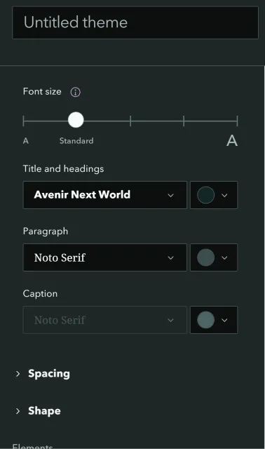
Before you create a StoryMap, there are different options in the StoryMap Theme Builder to customize your theme. This gives you a lot of flexibility to choose high contrast colors for your background image and text fonts and colors for various buttons that get displayed. Allen Carrol’s blog is a great resource to learn more about choosing colors and fonts and styles for buttons, quotes and separators,
2. Customizing fonts
Once you are in the theme builder, you can customize the fonts. Based on this wonderful blog, ESRI has recommendations in terms of best practices for choosing fonts. In general, it is recommended to use fonts that are not decorative. Certain font styles are curved or round on the edges and can make it harder to read. Common fonts such as Ariel, Times New Roman, Serif work well. Also, using fonts that are bold and italicized are also not a good choice. Read this blog to learn about choosing the right font for your StoryMap. The blog on Making StoryMaps Accessible from ESRI also has a section on Typography and key considerations to keep in mind when choosing the heading fonts versus paragraph fonts. The blog on Maps/StoryMaps and Accessibility also has a section on Recommended Best Practices based on fonts.
3. Choosing colors
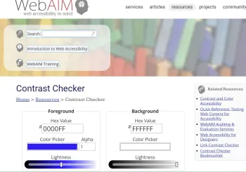
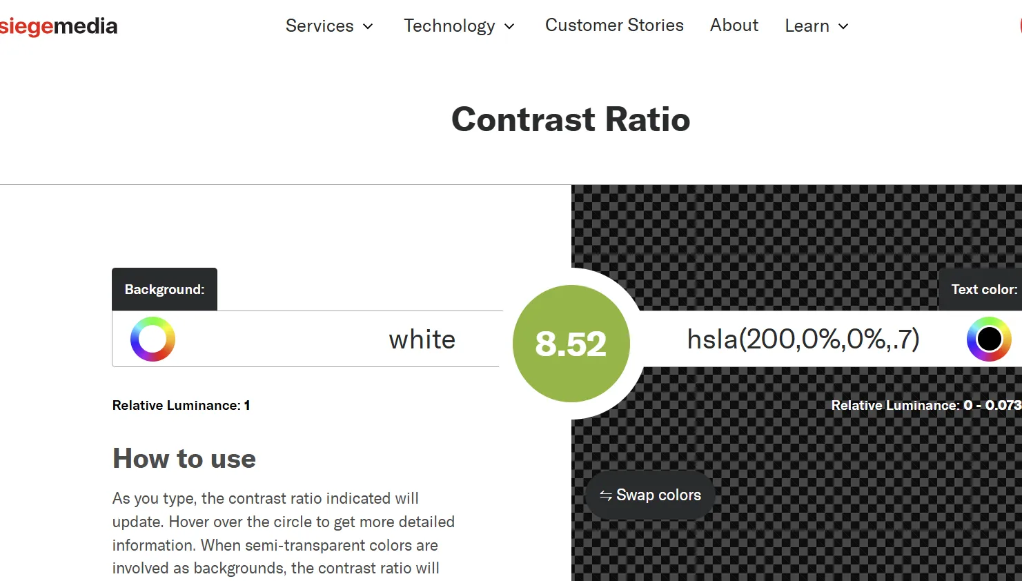
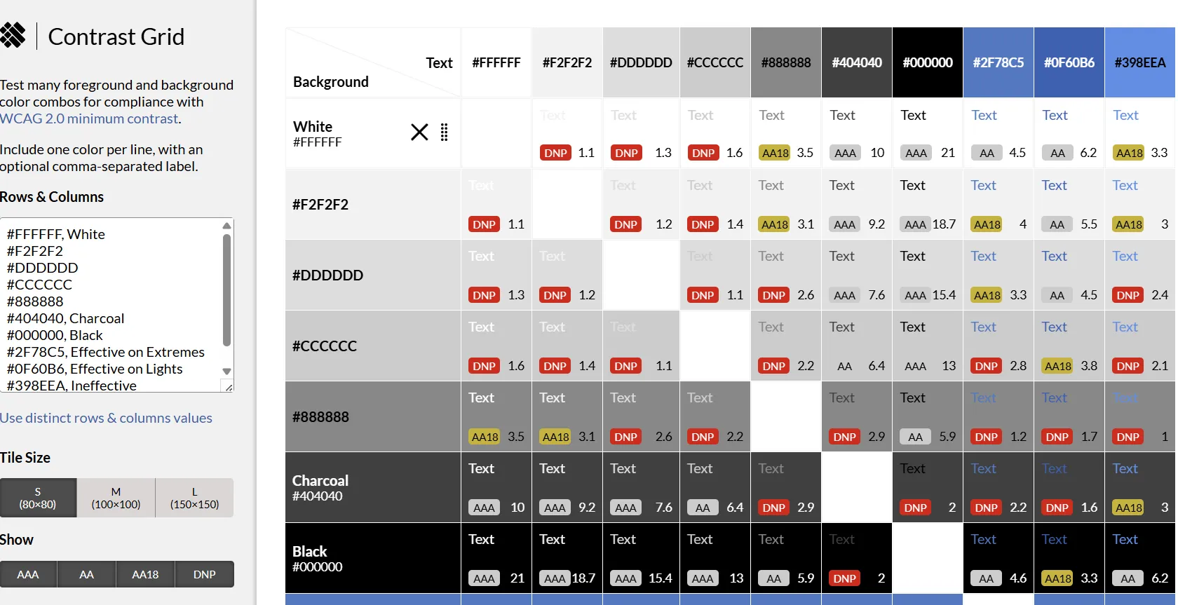
Once you have decided on the fonts, the next task is to choose colors that show high contrast. As per the WCAG guidelines, choosing a color contrast ratio of over at least 4 between text and background is required. Tools like WebAIM Contrast Checker , siegemedia Contrast Ratio are some tools to check whether the heading color, fonts color and the background color have a sufficient contrast. Another nice tool to check for a combination of colors is an eight shape contrast grid.
4. Online apps for testing images for different conditions
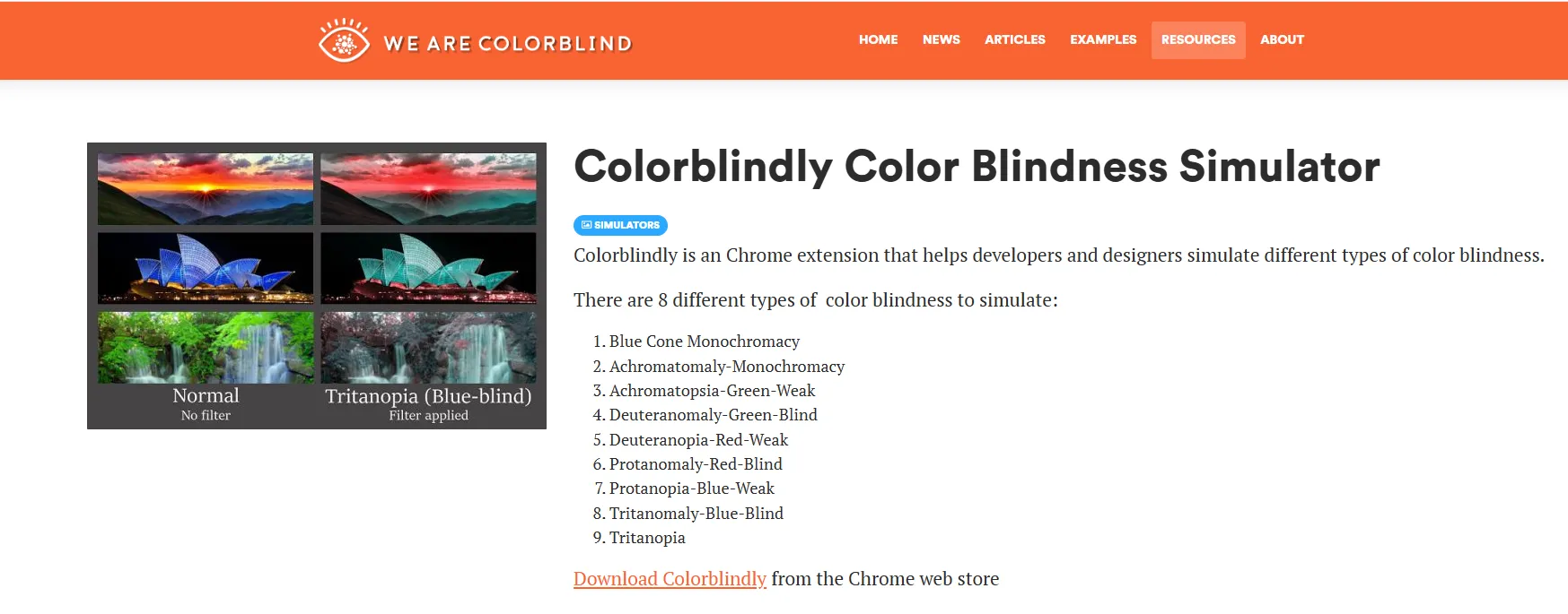
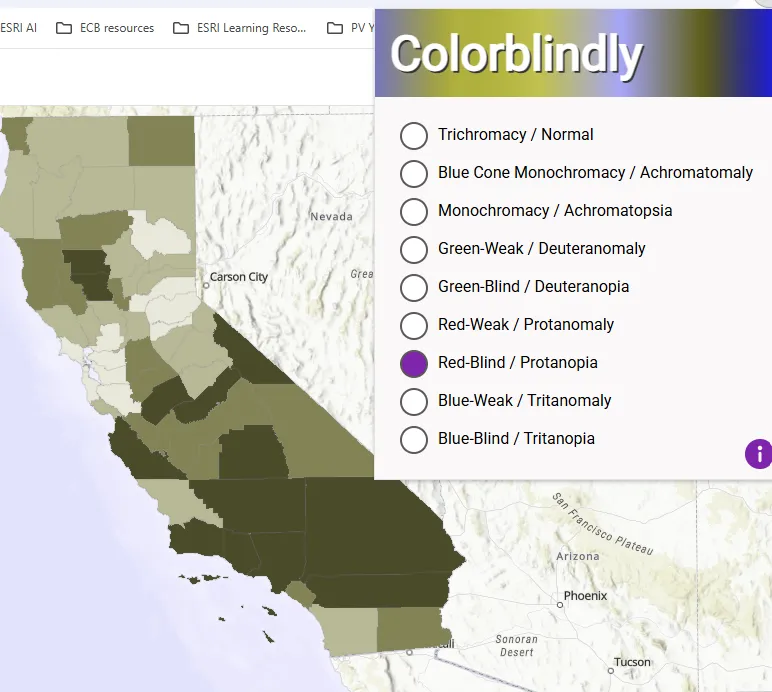
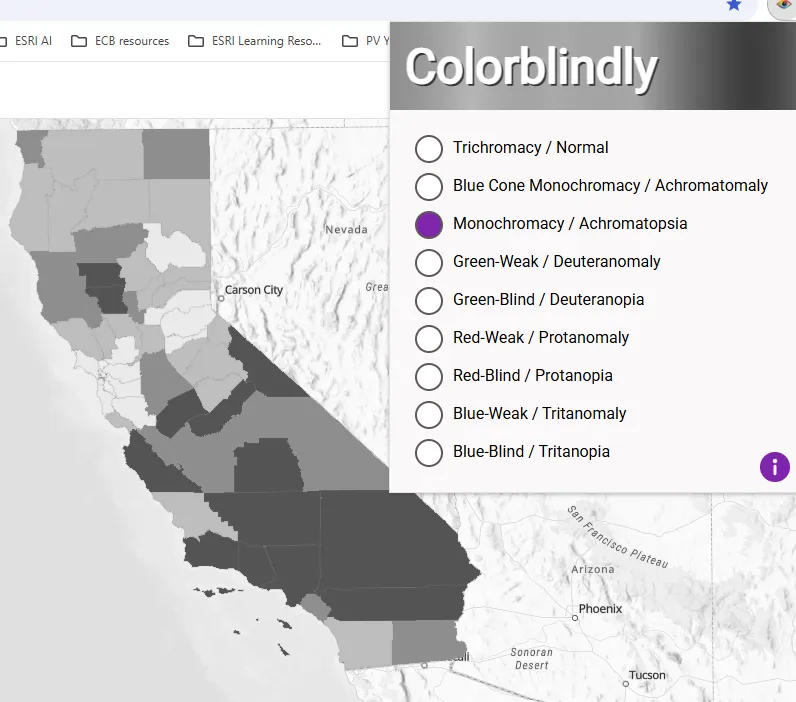
Additionally there are also tools for checking images by simulating different conditions for accessibility such as Color Oracle, Colorblindly among others.
5. Organizing the content structure
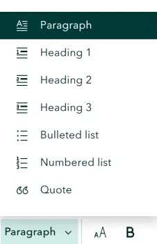
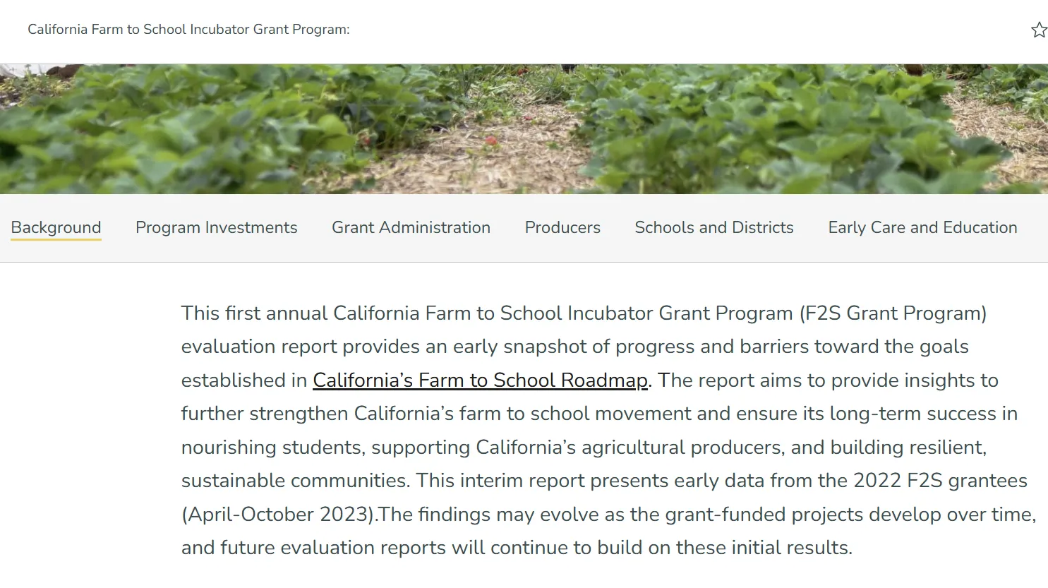
When you enter the text for your StoryMap, the builder forces you to choose the type of text you are entering: Heading 1, Heading 2, Heading 3 or Paragraph. This hierarchy makes it easy for the screen readers to navigate through all the vast content. Even though the recommended practice is to have only one Heading 1, this might not be the most suitable approach for StoryMaps. In case of StoryMaps, any text you choose as Heading 1 gets displayed as a tab on the top. This makes it easy for a user to navigate between the different sections of a StoryMap. As in the Farm to School StoryMap in Figure X there are different tabs for each section. For these labels to appears as a tab, it is important to designate them as Heading 1.
6. Alt Text on images
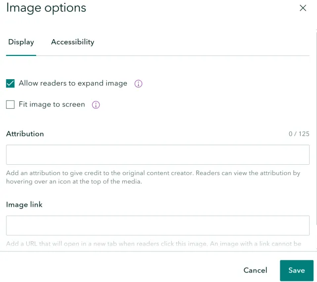
StoryMaps has an option to add Alt Text on all the images. The Alt Text should describe the image adequately, not repeat the same content that is in the web page or somewhere else. Words like “image” should be avoided in the alt text as it is redundant information for someone using a screen reader. For decorative images or images that have purpose to convey information the alt text should state as decorative or it can be skipped. While the standard practice is to label the image as decorative, as per a resource on ESRI’s website if an image doesn’t have alt text, the screen reader automatically treats it as decorative. Besides adding Alt Text on images, ESRI also recommends checking the box on "Allow readers to expand image".
7. Adding narration with static map images
EXTERNAL IMAGE
Just because StoryMaps allow a lot of interactive elements such as dashboards or interactive web-maps that allow users to zoom in and out to different places and explore data on their own, it doesn’t mean that this is the recommended best practice.
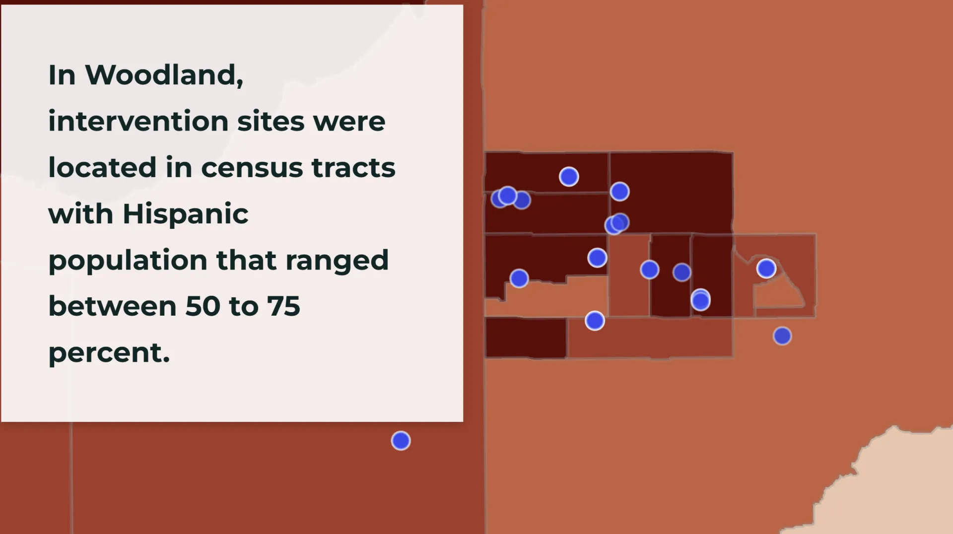
StoryMaps are about telling stories with the data. The onus is on the user to tell a compelling narrative, highlight different places on the map that tell the story. This offers a nice opportunity to spend some time with your data and identify the various places you want to highlight using static maps and images.
8. Choice of basemaps
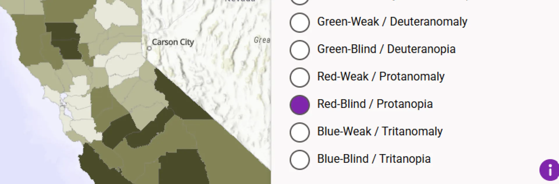
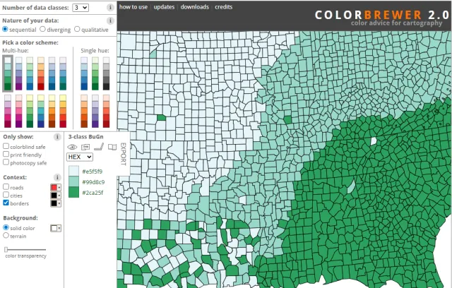
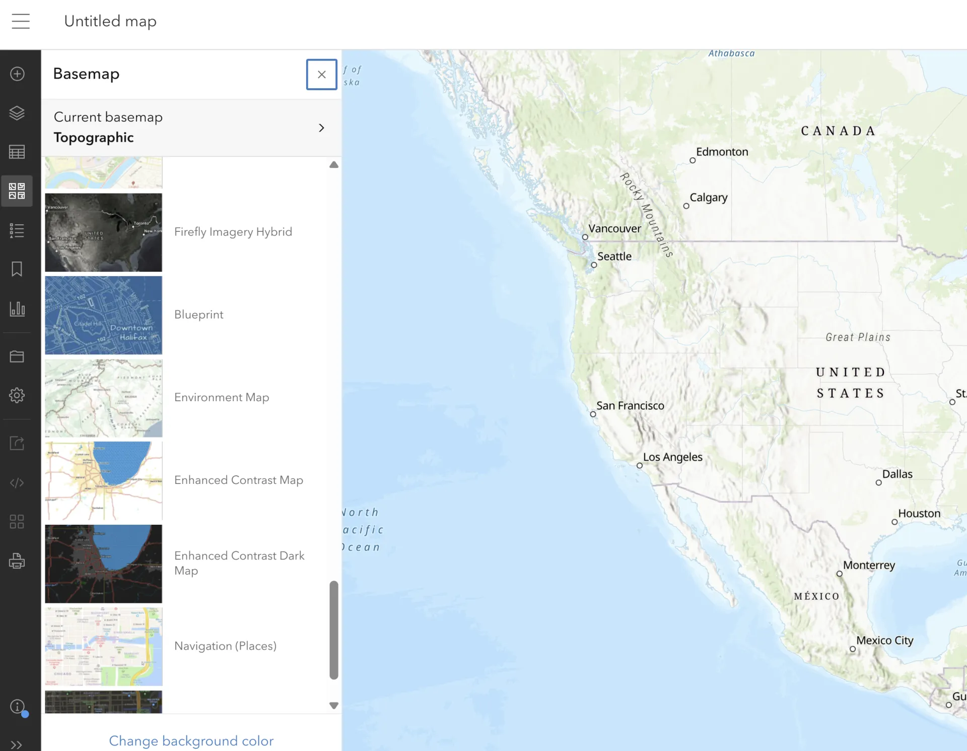
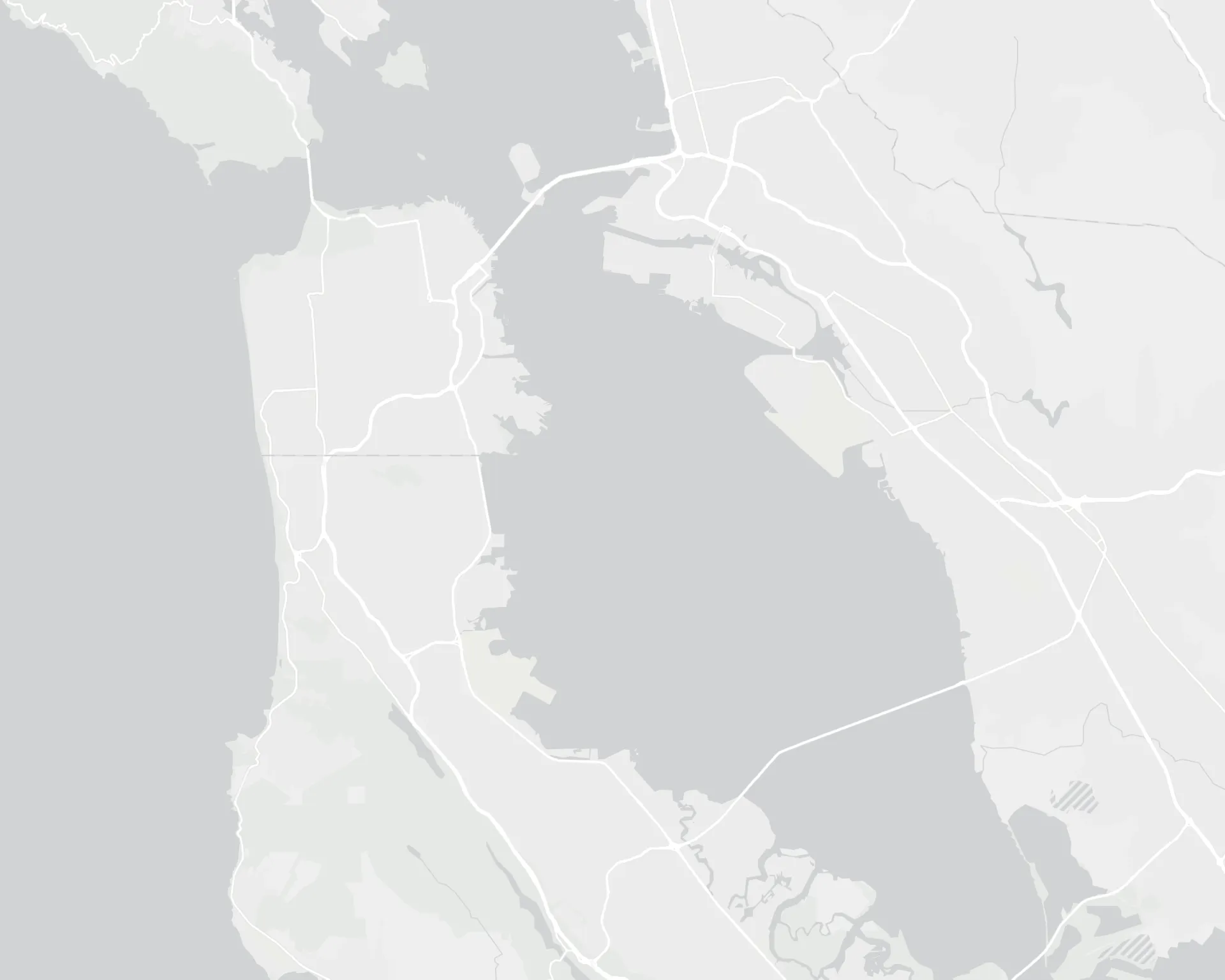
As one adds map content to the StoryMap or adds locations within the StoryMap, ESRI has designed various basemaps that are available through the Living Atlas. A simple option is to use gray basemap. ESRI recommends using high contrast basemaps. These basemaps can be accessed through Living Atlas or within Map Viewer in ArcGIS Online. Basemaps provide contextual information related to geography such as oceans, hilly areas, forests as well as major towns and population centers. Based on Andy Skinner's blog post on ESRI website also offers guidance on labels and fonts on the basemaps. Depending on the style of basemap sometimes the labels can be distracting. ESRI also offers ways to customizing basemaps in addition to offering different options that are colorblind friendly as shown in Figure 13.
9. Configuring text in the pop-ups of web maps
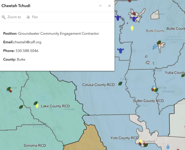
Web maps allow keeping the pop-ups on for a user to interact with the map and see some key attributes associated at that location. The default style in the pop-up is to display the data in the format of table. However, from an accessibility point of view it is recommended to avoid tables when not needed. Tables do not make a pleasant experience for a screen reader. ESRI recommends using text based format in the pop-ups as shown in the Figure 15.
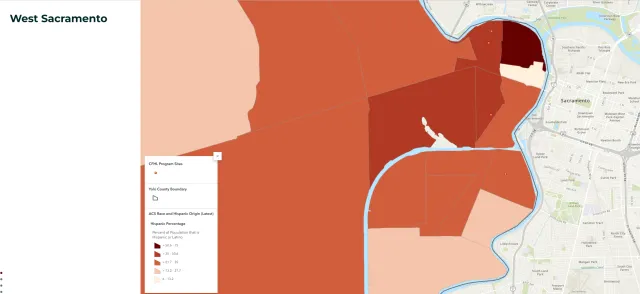
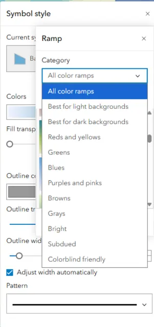
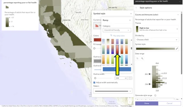
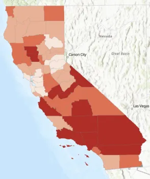
10. Choice of symbology and colors in the web maps
When using maps you created, ESRI has some colorblind friendly color ramps to choose from. In the Map Viewer when a user chooses symbology, they can go to edit styles and instead of using the default color ramp, ESRI provides various options as shown in the Figure 16 and Figure 17.
There is also a colorblindly extension which can be installed and turned on to check for different conditions.
Overall, ESRI provides a variety of tools and has several resources to make their products confirm accessibility requirements. While ESRI has provided a Accessibility Confirmance Report for StoryMaps through Voluntary Product Accessibility Template , the onus is on individual user to follow the recommended practices and ensure a smooth user experience.