Sample IWP Site

Every page should begin with an introductory paragraph that explains who you are, what you do, and the purpose of the page in 1–3 sentences. Place this before listing events, announcements, or other details. This opening helps visitors quickly understand the page and provides essential context for the rest of the content. Use plain language, avoid jargon, and aim for an 8th-grade reading level.
Tip: You do not need a heading before the introductory paragraph. The H1 (page title — in this site's case, the H1 is "Sample IWP Site") already introduces the page, so the intro paragraph follows it directly. The first H2 should only appear when starting your first main section of content (below).
This Is a Header 2, Left-Aligned and In Title Case
Use H2 for main sections of your content. All headers and text should be left-aligned (not center-aligned) and in title case.
Always use headings in order (H1, H2, H3, etc.) and never choose a heading level just for how it looks. Keep sentences under 25 words, break up text with bullet points, and write in active voice. Here's more information about headers, using an unordered list:
- Use only one H1 per page (used for the page title)
- Use heading levels in a logical, nested order (for example, H2 → H3 → H4). Use H2 for main sections, and H3 or H4 for subsections
- Do not skip heading levels (for example, don’t jump from an H2 straight to an H4), even if the layout looks fine visually
- Don’t use headings just to style text. Use them to represent content hierarchy
This Is a Header 3
Use H3 for subsections within an H2. These help break down complex topics. Multiple H3s under the same H2 are fine. You can have H2 → H3 → H3, then return to a new H2.
Using buttons and link text
Links help users navigate your site and find more information, so it’s important to make them clear and easy to read. For more details, see the full guidance on link text best practices.
Button Styling
Reserve buttons for major callouts, like a key service, event, or form, usually on the homepage. Use them sparingly, avoid placing multiple side by side or stacked, and always give them space to stand out. A button should highlight the single most important action on the page.
Do:
Example of a primary button style
Don't:
Adding Visual Interest
Visual elements can make your content more engaging and help break up long sections of text. The key is to use them with purpose and follow accessibility best practices.

Photos, Videos, and Other Media
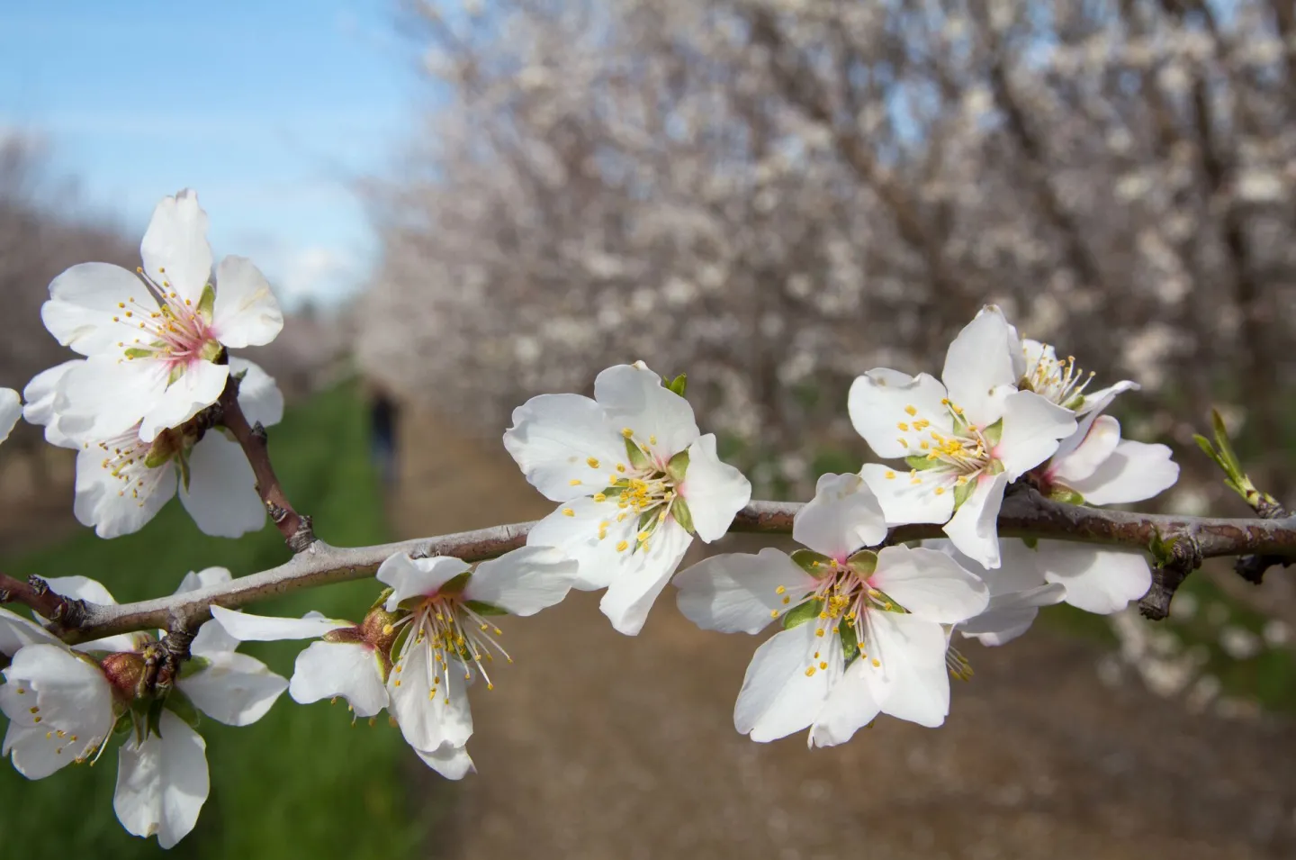
You can use photos, videos, and other media to add visual interest to your site — just make sure each element is accessible. The photo on the left was placed using the "Insert media" option in the CKEditor, with the "Align left and wrap text" option. This is a medium size photo.
Tip: Avoid using tables for design purposes, like arranging images or formatting a page. Tables do not always adjust well on mobile devices, and can be frustrating for visitors. Instead, use the Bootstrap Grid tool, which is designed to create layouts that are flexible, accessible, and mobile friendly.
More tips on using photos and videos
- Always include alt text for images. Alt text should briefly describe the content and purpose of the image for users who cannot see it
- Add captions for images when the image conveys information that requires context (such as who, what, where, or when), presents data (charts, maps, infographics), requires attribution or a photo credit, or plays a key role in understanding the surrounding content.
- Images that are purely decorative or used only for visual support do not need captions. In those cases, appropriate alt text – or an empty alt attribute for fully decorative images – is sufficient.
- For videos, ensure captions are built into the video (or enabled through the player)
- Do not put words inside images. Text should always be in HTML so it can be searchable, selectable, and accessible
Contribute for a Better Future
Office Locations
Optional component / Location Name and Brief Contact Information
2801 2nd St.
Davis, CA 95618
United States
