
Using Bootstrap Grid
The CKEditor Bootstrap Grid tool makes it easy to build responsive layouts that look great on any device. You can add rows and columns directly in the IWP text editor, then fill them with text, images, or media while controlling the size and balance of each section.
Why use it:
- Create layouts that adjust to any screen size
- Add promo-style modules or callouts to highlight key content
- Keep designs clean, consistent, and mobile friendly
Best practices:
- Keep modules simple and uncluttered. Homepage content should give a quick preview and link to deeper subpages for the full story.
For more tips and examples, visit the IWP Training Site.
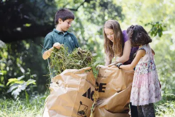
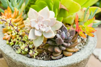
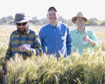
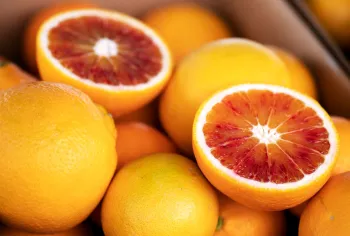
Example of bootstrap layout / Highlight box / 33:66% Grid

This is a header 3 but it can be header 2
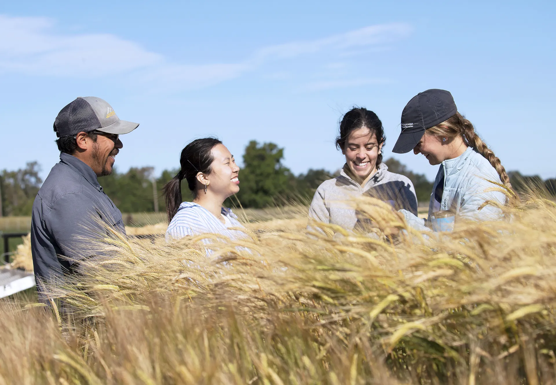
This is a short blurb highlighting a featured resource, service or other information. In this example, the photo appears on the left and the text on the right, but you can swap their placement. Keep it concise so users quickly see the value and know where to go for more details.
Example of bootstrap layout / List View
You can stack multiple Bootstrap Grid sections on top of one another to create a visually engaging list view. This approach works well for presenting a series of promos, content blurbs with links to deeper subpages, success stories, or featured resources.
Quick tips:
- Keep each grid section consistent in style and structure so the list feels cohesive
- Use clear headlines, concise blurbs, and relevant images for each item
- Limit the amount of text in each grid cell to avoid overcrowding
- You can use a heading style within the columns, but make sure your headings stay in logical order for accessibility
- It’s cleaner to keep images in one column and all relevant text in another for readability and scannability
- Choose images that are the same size to begin with, and be sure to select the correct system size when importing them into the column

This is a header 3
This is a short blurb describing something related to Header 4. It can be a brief description of a page you want to drive users to.
This is a CTA (Call to Action) link using the default link styling, not a button style
This is a header 3
This is a short blurb describing something related to Header 4. It can be a brief description of a page you want to drive users to.
This is a CTA (Call to Action) link using the default link styling, not a button style
This is a header 3
This is a short blurb describing something related to Header 4. It can be a brief description of a page you want to drive users to.
This is a CTA (Call to Action) link using the default link styling, not a button style
This is a header 3
This is a short blurb describing something related to Header 4. It can be a brief description of a page you want to drive users to.
This is a CTA (Call to Action) link using the default link styling, not a button style
Featuring Upcoming Events (with Bootstrap Grid)
Many groups want to showcase a few upcoming events more prominently on the homepage. You can use the same Bootstrap Grid layouts shown above to present a short list of event teasers that look clean and work on mobile. Just make sure events don’t overwhelm or replace the more permanent information about who you are and what you offer (e.g., place events after the intro paragraph). Think of events as a way to add timely updates that support your main content and show what’s happening now.
Quick tips:
- Show the basics: title, date, time, and a one-sentence blurb
- Link each teaser to the full event page for details and registration
- Use images only if they add value, and include alt text
- For clean presentation, keep all text in one grid column and an image in the other
- One call to action or link per event is enough
- Update or remove past events so the section stays current
- Remember: You can use a heading style for event titles so they stand out, but make sure your headings stay in logical order for accessibility
Example: One event
Here’s how one event teaser might look when placed in a two-column grid (33:66%):
- Left column: Event image with alt text
- Right column: Event title, date/time, and a one-sentence blurb with a “Register now” link in primary button style
Featured Event
Community Workshop: Building Digital Skills
September 12, 2025, 2:00–4:00 p.m.
Learn practical tips for improving your online presence and using digital tools effectively.
Example: 2 or 3 events
Here’s how event teasers might look when placed in a list view:
- Left column: Event image with alt text
- Right column: Event title, date/time, and a one-sentence blurb with a “Register” link in default link style
Upcoming Events
Event title 1
September 12, 2025, 2:00–4:00 p.m.
Learn practical tips for improving your online presence and using digital tools effectively.
Event title 2
September 12, 2025, 2:00–4:00 p.m.
Learn practical tips for improving your online presence and using digital tools effectively.
Event title 3
September 12, 2025, 2:00–4:00 p.m.
Learn practical tips for improving your online presence and using digital tools effectively.